Friday, March 30, 2012

Research Statement & Annotated Bibliography: Bauhaus


The research topic I have decided to delve into is the History of the Bauhaus, along with the design styles, ideas, and concepts generated by said school. 

Source 1: Book with a single author
Hochman, E. S. (1997). Bauhaus: Crucible of Modernism. New York, United States: New York: Fromm International.

Elaine Hochman analyses the context of the Bauhaus school. Why the time the Bauhaus School was created and open was so turbulent, and yet why it was so instrumental to making it an icon for Modernism worldwide today. Placing the origin of the Bauhaus in social and historical context is both important for understanding the style as well as the why it came about.

Source 2: Scholarly journal article
Sachsse, R. (2000). Made In Germany As Image In Photography And Design. Journal of Popular Culture, 34(3), 43-58. Retrieved from ProQuest Central database.

Rolf Sachsse looks in depth at the origin of the white or black background when photographing design objects. It appears that said style is derived from original Bauhaus photography and printing methods. This article is definitely useful since it shows how the Bauhaus has influenced some of the little commonplace things we don't expected to be designed per se. 

Source 3: Edited book 
Wingler, H. M., & Stein, J. (Eds.). (1978). The Bauhaus: Weimar, Dessau, Berlin, Chicago. Cambridge, United States: The MIT Press.

The Bauhaus is the definitive book on all things Bauhaus. Wingler & Stein have collated a huge collection of sources of note regarding the Bauhaus. Sources include public manifestos, meeting discussions, books, newspapers, magazine articles. The assembled material isis a significant collection of primary sources, which makes it invaluable for a research paper. 

Source 4: Website 
Design History. (1999). The Bauhaus. Retrieved from http://designhistory.org/

Design History's lecture topics provides a detailed account of the history of the Bauhaus, and also talks in depth of the teaching styles and education topics used in the School itself at the time. The source is easily accessible, and also sources its data from a lot of primary sources, which again is valuable for a research paper.

Source 5: Image
Schmidt, J. (Graphic Artist.). (1923). Poster for Bauhaus Exhibition in Weimar [Poster], Retrieved March 29, 2012, from http://germanhistorydocs.ghi-dc.org/sub_image.cfm?image_id=4297

The Poster for Bauhaus Exhibition in Weimar is a very significant image historically. It shows a new, fresh take on advertising at the time, and it many respects, has inspired thousands of graphic artists the world over. The importance of this poster to the history of the Bauhaus cannot be understated.

Thursday, March 29, 2012

Individual Work

Use what was learned and analyse a precedent and take a drawing from one of the previous parts and explore it using a technical drawing style. I analysed the style of the Dutch Bauhaus-esque design De Stijl. The picture I derived my idea is copied below. I found the idea of an exploded object really appealing, since it really allows one to fully understand the object in a way that plans and elevations can't really do. The technical drawing method of exploding the object worked best in planometric, as well as this being the same technique that De Stijl used in the precedent image. Doing an explosion on a Swiss Army Knife was also extremely informative and interesting.
Done in pen and permanent marker.

Precedent Drawing


Individual Work

Touch & Draw

Analyse an object with "Innocent Eyes" and attempt to capture the essence of the object.  The object I chose to do this for is my hex-nut bracelet, of which there are two, my significant other having the matching one. I sought to capture the essence of this connection via two physical objects, as well as what the object was on paper.
Done in charcoal and permanent marker.


Section

Draw accurate sections of the chosen object and then compose them into an abstract design.
Done in pen and permanent marker.


Draw

Investigate an object through various freehand technical drawings and details. 
Done in pen and permanent marker.


Hatch

Each of the 24 squares needed to have it's own unique texture, and all of them together were meant to form a gradient on the page.
Done in pen.

Identity

Developed from a given precedent, compose 5 items of our own using the composition lines derived from the precedent, and then draw them.
Done in pen and permanent marker.


Monday, March 26, 2012

DSDN 144 Project 1: Final Images

"Suicide"

For “Suicide”, I was seeking to follow the journey of an unknown individual to their death. Along their way, they will have encountered certain spaces, which I want to capture. I want to capture the essence and special-but-plain-ness of these spaces. I want to create a narrative of this unknown essentially walking their last journey.

I believe I captured this narrative successfully, capturing both the frightening nature of the night as well as the freedom it provides. Some of the spaces I have captured are rather public, while some of the others are much more personal and have a special element to them. I relied heavily on the use of subdued colours, light, and contrast to convey this narrative. I really wanted to help myself understand these particular spaces. “why this space?”
 
I used a lot of very confronting composition to juxtapose the almost softness of the night with the real reason why this person was there. I drew a lot of inspiration from Neil Pardington and Mark Power, and their almost colourless spaces in their photos.
 
Ultimately the narrative is meant to culminate in freedom, and signify this unknown person’s liberation from their body, and I believe over the course of the images that this is achieved.
 Image 1, copyright Sebastien Voerman

 Image 2, copyright Sebastien Voerman

Image 3, copyright Sebastien Voerman

 Image 4, copyright Sebastien Voerman

 Image 5, copyright Sebastien Voerman

 Image 6, copyright Sebastien Voerman

 Image 7, copyright Sebastien Voerman

 Image 8, copyright Sebastien Voerman

 Image 9, copyright Sebastien Voerman

DSDN 144 Project 1: Contact Sheets / Final Shoot

These are the contact sheets for the very final sheets. The variety is low since I knew what I wanted, I just wanted to get every single image just right.


DSDN 144 Project 1: More Precedents

I have decided to look at some more precedents for this project, just to aid in how I can establish and define my work.

My fourth precedent is Eugene Atget, who in his time was very much a lone wolf. He didn't start any movement, didn't attract a large amount of followers, but created extremely pure and beautiful images that have outlasted him. His pieces show spaces that feel almost surreal, but at the same time are extremely visceral.

 Copyright Eugene Atget

 Copyright Eugene Atget

Again, like Mark Power, Atget conveys the true space, in it's pure form. The spaces still have an ethereal feel to them however, and they almost seem to have stepped out out of an old novel. The time Atget lived in considerably reduced what he could do with the camera, however, I feel that ultimately his photos have not suffered. They don't lose any of their charm through age.


My fifth precedent is Michael Kenna, who has a tendency to take beautiful night-time shots. These shots of the relatively mundane become special through his photographic vision. He doesn't portray destruction, but endeavours to present the spaces beautifully and simply. Longer exposure night shots tend to show a very odd but fantastic light play.

 Charles Bridge, Czechoslovakia, copyright Michael Kenna

 Ratcliffe Power Station, UK, copyright Michael Kenna

His black and white photos portray the places in an unusual light, since a lot of them are also taken at night, so the light is a lot different to how it would diffuse during daytime. Like Eugene Atget, he tends to portray things as they really are, without adding too much emotion or story to them. The power stations however are given a certain gracefulness which isn't evident in them normally.


My final precedent for this project is Neil Pardington. He takes an interesting set of photos. A lot of them tend to have an in-your-face feel about them, and feel almost slightly oppressive in the way they are taken. The eye is not allowed to wander around very much, it tends to be directed towards a single point, which has a very controlling feel to it.

Tunnel #4, copyright Neil Pardington

 Pool, copyright Neil Pardington

Again, like my other precedents, Neil Pardington has a tendency to present things as they really are, without trying to introduce too much of a narrative. His work relies heavily on greys, which also conveys the purpose the industrial and functional spaces have.

Photos from:

Wednesday, March 21, 2012

DSDN 144 Project 1: Contact Sheets / Second Shoot


DSDN 144 Project 1: Photo Choices from Second Shoot

 These are my favourites from the second shoot. The sequence is the way I imagine the journey to unfold. The whole mood I'm trying to convey is the mystery of the night, and yet still maintain the intrigue and curiosity with the lighting. The journey of this anonymous person should have a definitive air of loneliness, as well as a sad but ultimately free feeling.

This shot of the alleyway finally feels right, whereas it didn't in the first shoot. The composition is much better now, and the lighting is exactly how I want it to be. For the final shot, I need to make sure I get the height of the camera correct. The feel I'm going for is a journey, so the camera should feel like someone's eyes.

This space just prior to the winding staircase has a really interesting feeling to it. It feels oddly austere, with the light almost infiltrating onto the space from behind the bars. And yet the light makes the space what it is.

This show also lets light filter through the bars, however, in this instance it's a lot warmer, and feels less threatening. The warmth of the orange light makes freedom feel a lot closer as opposed to the harsh white light of Image 2.

This car park feels oddly threatening, but then I guess at night there are very few car parks that don't feel that way. For the final shot, I need to organise a tripod and ensure this sht is perfectly level horizontally. I get the feeling I was slightly off.

This shot down to the ground in a similar area where the person would have jumped has an extremely geometric feeling to it. But that, coupled with the light at the bottom was what I was going for. I'm so glad the cars at te bottom finally decided to move... I was waiting for ages.

Again, I've used pre-existing light to create a sense that hope is possibly near, and freedom is at hand. However, the light is only illuminating what I feel would have been a transitory space, a space where the protagonist of this journey would have only stayed very briefly before moving on to their ultimate goal. I love how I composed this shot.

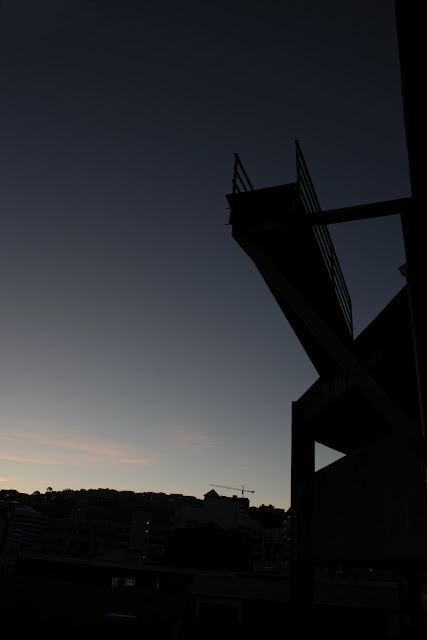
The penultimate shot, a shot of the final place itself. The darkening sky overhead lets us see that the end is not very far away, and it sillhouettes the railing dramatically.

The final viewpoint of our protagonist, as the city lights come on and the area grows cold. For this shot, I really need to get it level, because again, it doesn't feel it.

Tuesday, March 20, 2012

Paper & Card Model Making

Some of the models I've been making for DSDN 111, the idea is to make models that are 3 dimensional without using curves, and without using any adhesives of any kind. These are some of the results!


Tech Lecture 2: World


Sadly the panoramas I did last week were not 360 degrees, so making a miniature world using photographs I took wasn't possible. However, I decided to do a miniature world using a panorama from Mirrors Edge, a video game. Enjoy!

Thursday, March 15, 2012

DSDN 144 Project 1: Photo Choices From First Shoot

These are some of my favourite shots from the first shoot. Enjoy!


I need to try this shot again with better lighting, and possibly experiment with some better composition. Hopefully, also the cars should be gone for the next photo.


The lighting in this shot is pretty much what I'm trying to achieve, but I need to think about a slightly different angle to what I've chosen, possibly move around fractionally to the right and face the car park head-on.


While this shot shows the sillhouette of the final spot well, and the grey sky amplifies that sense of dread, I also want to try to capture this when the sky is clear, and compare the results.


The lighting in this shot is really cool, twilight-ish, but still letting the street lights play off the walls and the graffiti. But once again, I need to try composing the shot head on, since I still feel like I want to move around to the right in this shot.


This makes a good space out of the sky and between the buildings, but the composition still feels a little off. I need to attempt to improve it significantly.


This shot is really different to the others, as it uses the depth of field as well as a different angle to create dramatic effect and focus. However, I need to find a specific style to stick with for this assignment, and maybe this isn't it.