In our first class for the new project, we were told to choose a destination somewhere in the School of Design, and create instructions on how to get there. We had to choose how the instructions were going to be read, be it either written instructions, a map, or drawn pictures.
My group decided to do written instructions, as these made the most sense to us personally. We made the instructions very elaborate and made sure to include landmarks along the way, such as a bright yellow evacuation chair and a particular room sign. One of the things we decided not to do was give away the destination right at the start, because we wanted to see if it would be possible to actually direct someone to a location using only written instructions.
Our hapless victims were able to follow our instructions to the tee, and promptly returned with out little note which we placed at the destination.
Other groups tried different methods of giving directions, and the group from whom we got our set of instructions used a map. One of the flaws of their map was that their instructions made an assumption that the victims already knew the location. Had someone else from outside the school been given the instructions, they most likely wouldn't have found the destination.
However, their map method did have some advantages. Their map didn't only show the destination, but it also showed other facilities that were around the final destination point, which I have to say was very useful and another victim who might be unfamiliar would probably find this information very informative. The use of symbols to denote the different rooms, such as a dollar sign for the shop, and a hammer for the workshop was very effective, and definitely aided in finding the location.
For a highly effective directional system, a combination of both maps and directions would be the most beneficial system of navigation. Maps are a relatively universal guidance system, and therefore should be relatively intuitive. However, that said, there are a lot of people who have real trouble reading maps, so therefore the directions should assist them. The duality of this system should ideally address both types of users of a navigation system.
Thursday, August 30, 2012
Friday, August 24, 2012
DSDN 142: Final Code Result
So, I've finally found a creation by my code that suits my needs! She's smart, she's funny... I'm kidding.
This creation suits my needs, and I believe that it has turned out the way I want it.
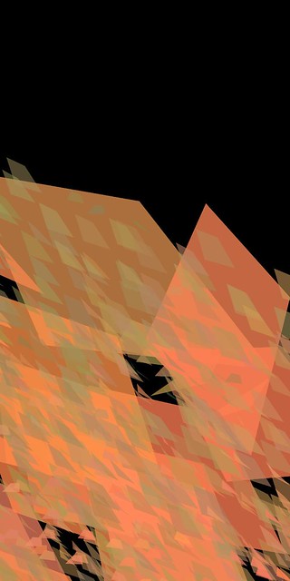
On the whole I'm pretty happy with this piece. Possibly one gripe that I have that I really should have dealt with earlier on is that the most noisy part of the piece possibly isn't where I want it to be. It might be slightly noisier in the centre than the right. I can't really fully tell because I've been staring at this for way too long.
The part I love the most is the fact that it's all derived from one piece of code that writes everything, at once. This just gives it a certain continuity that other codes done individually might not have.
On the whole, I'm pleased. :)
This creation suits my needs, and I believe that it has turned out the way I want it.
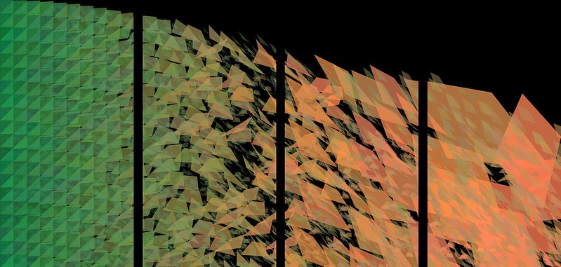
And here is all four of them composed as they would be composed on my board:
On the whole I'm pretty happy with this piece. Possibly one gripe that I have that I really should have dealt with earlier on is that the most noisy part of the piece possibly isn't where I want it to be. It might be slightly noisier in the centre than the right. I can't really fully tell because I've been staring at this for way too long.
The part I love the most is the fact that it's all derived from one piece of code that writes everything, at once. This just gives it a certain continuity that other codes done individually might not have.
On the whole, I'm pleased. :)
Thursday, August 23, 2012
DSDN 142: Strokes And Tones
So, I'm nearing completion now, and I'm starting to make only minor adjustments to the actual project. I now have my final form and how it's going to work, so the code is essentially almost finished. What I want to do now is just narrow down the exact way it's going to look.
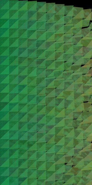
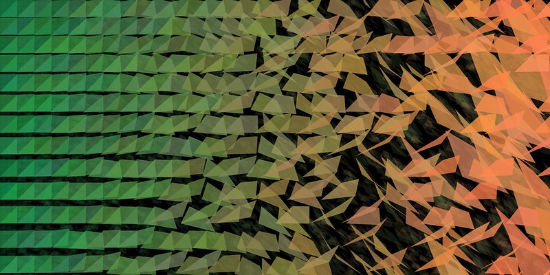
So I took the stroke away again, and then changed the code for the big loop so that the shapes don't extend across the page as far as they did before. This results in more individual shapes in the noisiest segment on the right, which I think assists in creating more noise. However, I think it might need just a few more quads there. It is just a little bit too sparse.

I kept the minimal shapes on the right for this one, but played with a shift in the colour for the small shapes. The resulting green might be just a little bit too strong. I think for my final I should go for a green shade, but maybe not as strong as the one I've chosen to go for.
This variant here is starting to look acceptable. Since there is an inherent controlled random variable in my code however, I'll need to run the code a few times until I find one I want. Not every version is ever going to be exactly the same, so one of them will present my vision better than the rest.
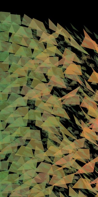
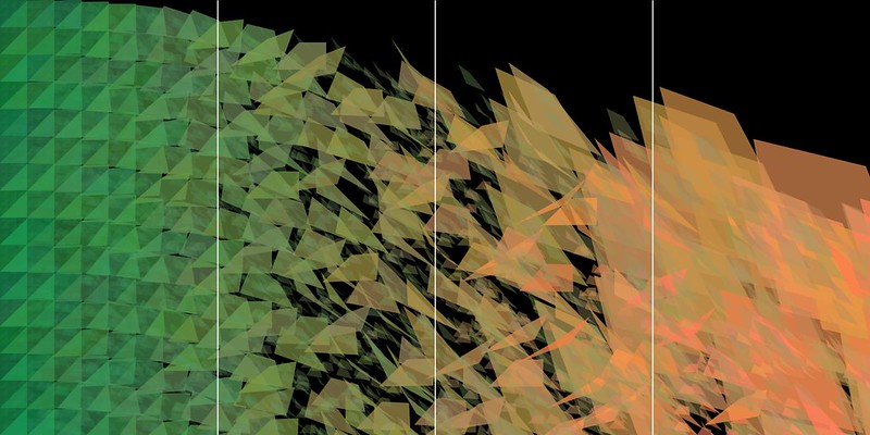
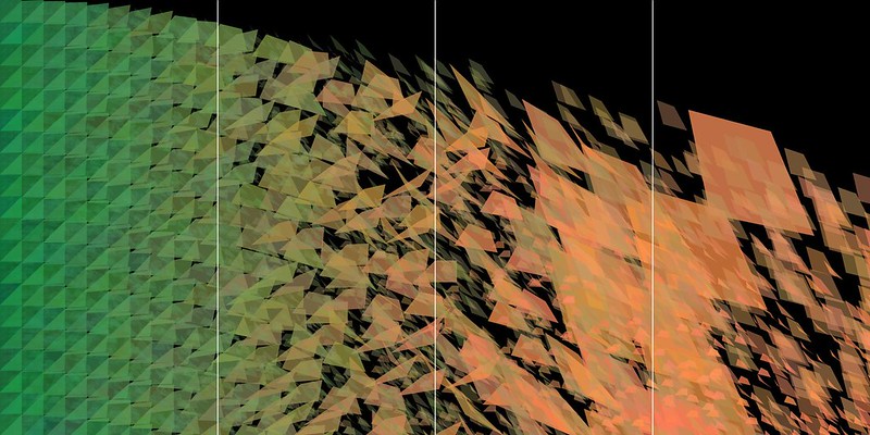
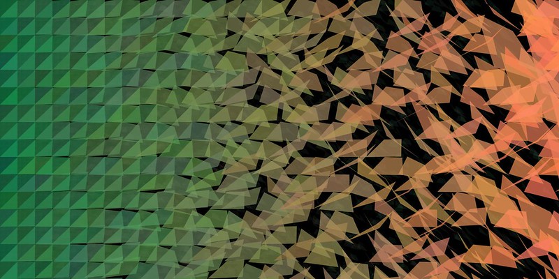
For the sake of making it easier to see the different segments, I added in some unobtrusive white lines, as guidelines. One of the major changes I did here was to make the background loop overlay the background, as opposed to being overshadowed by the main loop.
It's definitely still overshadowed by it, but it adds much more texture to the shapes, resulting in much more depth to the forms.
In this iteration, I tried out a 0 point stroke on everything, just to see what it would look like. I quite like it, but then I feel like it's detracting from the overall code and is just making everything a little too messy. It's not terribly effective. I also tried a white stroke, and that looked even worse. It totally loses control over how nice the code looks as just the shapes with no borders.
So I took the stroke away again, and then changed the code for the big loop so that the shapes don't extend across the page as far as they did before. This results in more individual shapes in the noisiest segment on the right, which I think assists in creating more noise. However, I think it might need just a few more quads there. It is just a little bit too sparse.
I kept the minimal shapes on the right for this one, but played with a shift in the colour for the small shapes. The resulting green might be just a little bit too strong. I think for my final I should go for a green shade, but maybe not as strong as the one I've chosen to go for.
This variant here is starting to look acceptable. Since there is an inherent controlled random variable in my code however, I'll need to run the code a few times until I find one I want. Not every version is ever going to be exactly the same, so one of them will present my vision better than the rest.
Wednesday, August 22, 2012
DSDN 142: Exponential Decrease
So, I've developed the exponential element into my code, now I just need to make it fit my description of summer into autumn more. I've come up with the idea of doubling up the code, and adding an extra background layer of much fainter, much smaller quads so as to give the whole thin more depth.
 So I added in another iteration of the loop, so as to provide a background element.
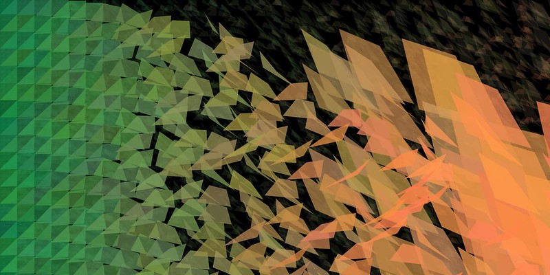
For this iteration, I got both parts of the code to curve down and look the same in that respect, and I also allowed the actual deviation to move further across the page than before, since I just felt that the first section of the code just wasn't structured enough or for long enough.
DSDN 142: Developing...
So, now that I've decided on a colour scheme, I've got to make my noise.


 I tried playing around with having the spread decay across the whole page which made for a rather interesting composition. I might explore trying to write the code for one composition that embodies all four section in one composition. Capturing both the elements of structure and noise across one large canvas.
 I also need to find a happy middle ground, where there is still a semblance of structure, and yet it is still breaking up into noise. However, I have to say I'm not terribly happy with this one. It feels devoid of "stuff". It feels rather weak.
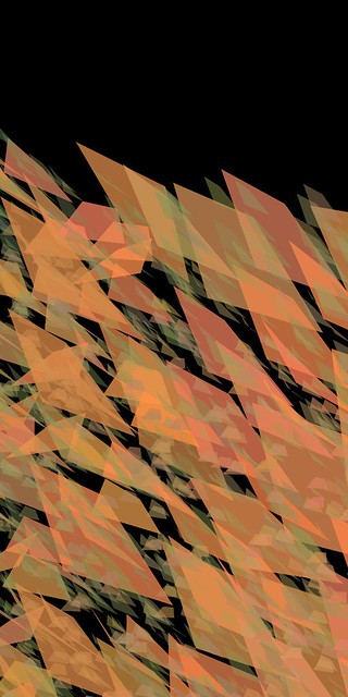
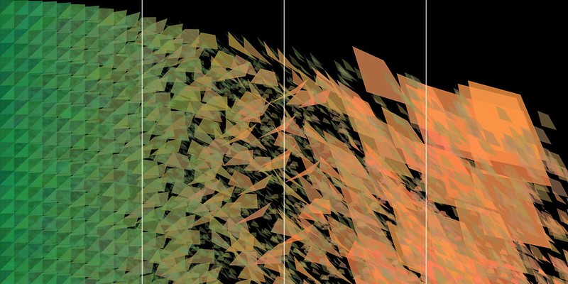
 In this image, I made some huge changes. I managed to like the count to the deviation, so that now as the shapes pass across the page, the deviation increases accordingly. This is starting to look like something I could use as my final!
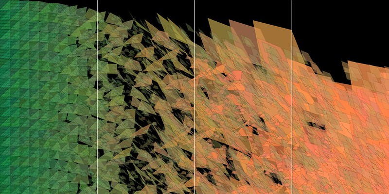
 I decided to input an exponential element into my code, an idea I came up with in a complete Eureka! moment. It was rather exciting, and allows me to make sure I have both my full structure and my full noise across the page.
Here is my original structure, so I'll use this one for my structure component of the four slides. The colour is quite strong, so actually I might balance the mid-shifting point to the exact middle, just to help the colours feel equal in value.
I tried exploring some elements of noise in this compositions. I implemented an extreme deviation, so that I can carry the total amount of randomness up significantly, but also allow it to be adjusted down as well, to get the total structure when the deviation is 0.
Tuesday, August 21, 2012
DSDN 142: Colour Theory & Code
Having decided on the colour scheme, here's a little overview of why I chose it.

Image retrieved from: http://watercolorjournal.wordpress.com/tag/color-combinations/
Green and orange form part of a triadic colour scheme, where three colours positioned in a triangular formation around the colour wheel form a really effective colour scheme in design.
The ideal third colour in this case would have been violet, but I really want to keep the number of pure colours to a maximum of two.
So therefore the two colours for my project will be green and orange.
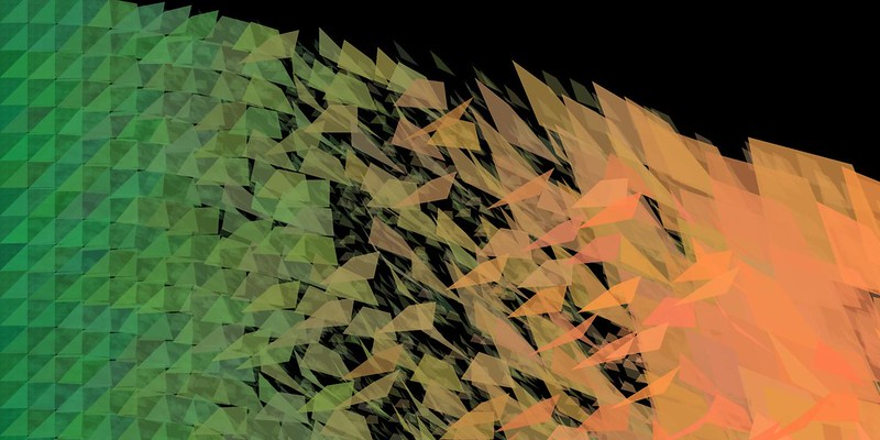
The colours also form an ideal shift from two seasons right next to each other in our four seasons.
The colours describe in the most simple terms the shift from summer to autumn, a seasonal change that we are all rather familiar with, living in a temporal climate.

Image retrieved from: http://periwinkleeyes.deviantart.com/
This wonderful image, done by an artist called Periwinkleeyes on deviantart describes exactly what I want to show in my structure to noise code. The shift from summer to autumn is exceedingly beautiful, and also provides an interesting structural element.
If we look at the comparison of the summer leaves on the trees versus the leaves of autumn scattered on the ground, we can see that there is far more structure in summer than there is in autumn. The way the leaves grow on the trees suggests a structure that we are only recently beginning to fully understand.
If we look at the comparison of the summer leaves on the trees versus the leaves of autumn scattered on the ground, we can see that there is far more structure in summer than there is in autumn. The way the leaves grow on the trees suggests a structure that we are only recently beginning to fully understand.

Image retrieved from: http://www.wallcoo.net/2560x1600/2560x1600_widescreen_wallpapers_greenleaves/html/wallpaper20.html
Meanwhile, in autumn, the leaves fall and swirl around in the wind, and fall to the ground, creating a noisiness on the ground where the leaves overlap and mix together, while on the trees, they were separated by species and therefore size and type.

Image retrieved from: http://www.ilankelman.org/autumn.html
So now that I have my structure and my noise, now onto the final home run!
Monday, August 20, 2012
DSDN 104: First Physical Translation!
So, it's pretty rough, but the essence of the model is relatively well conveyed. The curvature was also relatively well translated for a first effort.

I translated the model into Illustrator, and then adjusted all of the pieces so that they were fully opaque. This would allow me to easily translate the model into reality.
The edges are very jagged, but that was interestingly what was translated in the printing details. I think, to really convey how my model not only technically is, but also how it is meant to feel.
So, for the next model, I want to try and smooth the edges a bit, so that more of the curvature comes through in the model.


For the final, I definitely want to combine both the card and the acrylic into a harmonious whole.
I had an idea for a way of stacking the model, so that there is a distinct use of positive and negative space to generate the form of my model. I'll definitely be providing some more intel on that soon!
DSDN 104: Slices Of My Model
So, for the first part of our new project, I have to take my hero model and someone transform it into a tangible physical form. This isn't exactly going to be the easiest thing in the world, due to the inherently complex nature of my model.

So that's why I'm going to start really basic.
I've cut my model into 35 slices using the slice tool in 3dsMax, and then I did renders of each segment, front on, so as to capture the orthographic view of my model.
For ease of seeing most (I could only use a maximum of 20 images for this .gif) of the sections, I made a .gif so you can see the model as it would be sliced into pieces. The .gif starts at the front of the model and moves towards the back of the model.

To make it easier to form the illustrator files for this section, I changed the colour of my model to white, so that it would be easier to pick up on a black background. Having the model as glass on a black background would not help.
So that's why I'm going to start really basic.
I've cut my model into 35 slices using the slice tool in 3dsMax, and then I did renders of each segment, front on, so as to capture the orthographic view of my model.
For ease of seeing most (I could only use a maximum of 20 images for this .gif) of the sections, I made a .gif so you can see the model as it would be sliced into pieces. The .gif starts at the front of the model and moves towards the back of the model.
To make it easier to form the illustrator files for this section, I changed the colour of my model to white, so that it would be easier to pick up on a black background. Having the model as glass on a black background would not help.
DSDN 142: Colour & Form Exploration
So I've been playing around with my code a lot now, and I've decided to settle on using the quadrilaterals as my point of origin for my code to work.

This here is going to be the baseline for the the rest of the noise to originate from. I also figured out how to do proper colour gradients as well, which is really exciting, since they look really cool.
Applying a deviation into the shapes really allows for a large amount of variation and noise.
As we can see here, I took the same arrangement of the colour gradient, and applied the deviation to the overall code, resulting in a much more noisy variation on the work before. The shapes I have chose allow for a lot of variation when implementing randomisation in a controlled manner.

Looking at the colours I had chose prior, I decided there were far too many, and that I needed to cull the amount a little bit. I'm thinking a two-tone element is going to work really well. I tried out a pink and a green, but while this set really does provide contrast, it doesn't really please aesthetically.

DSDN 112: Final Images, Description & Instructions
The Cheek Sense is a sensory board that explores the variable concepts and sensitivities of touch in two different areas of the body. The board presents a series of interesting textures, and one’s cheek is used as the primary sense to explore the textures.
The experiment is designed to explore not only the sensitivities of one body part to another, but also to explore the notion of trust through the lack of sight. Protecting one’s face is a very human quality, and this design challenges people to trust that the textures won’t damage them.However, the primary objective of the design is to compare the interpretation of the textures on the cheek versus the fingers. The different surface areas and numbers of nerve endings ensure both experiences are independently unique.
Instructions & Images
- Establish where the board is.
- Don the blindfold. Ensure it doesn't cover the cheek.
- Get someone to lift the curtain for you and roll it up.
- Place your right cheek on the right-hand end of the board, and move your cheek forward along the board at a pace that suits.
- When you have reached the end, go back and move your fingers along the textures in the same way.
- Think about different words you would use to describe the experience.
- Contemplate the difference between the sensations.
- Realise how much more “intelligent” your fingers are.


Sunday, August 19, 2012
DSDN 104: Laser Cut Inspirations
So for our second project in Digital Creation, we have to take our final model from the first project and translate it into a physical 3D form. However, there's a catch. It has to be completely made from 2-D segments cut on the laser cutter, and we only get one A4 of 2mm clear acrylic and one A4 of 1mm card.
We get one shot at the laser cutting, and we have to then make our model with what we are given. No do-overs.So I'm still not 100% on how I'm going to translate my model into an actual physical form, but I'm sure I'll come up with an idea.
I decided to have a look at some artist models for laser cutting, so as to get a feel for how you construct this kind of model. One of the common techniques appears to be layering up the individual shapes, allowing for a stacking effect that generates form.

Image retrieved from: http://www.treehugger.com/sustainable-product-design/downloading-designs-generatorx-20.html
Here we can see that effect used to generate both negative and positive space. This design is actually laser cut out of paper! I think it looks really damn cool. I really want to find a way of incorporating both negative AND positive space.

Image retrieved from: http://inhabitat.com/laser-cut/
This chair is awesome. I want one. Badly. It looks like a rock formation that has been eroded by time, and yet it's been made of plywood. Which is rather astonishing in itself. The fact that a material as lacklustre as plywood can be formed into something as beautiful as this through craft and technology is rather impressive.

Image retrieved from: http://dailyartmuse.com/2008/05/05/bodacious-curves-from-roussel/
This piece of jewellery is so cool! I'd really like to make one myself actually, for a special someone! Maybe next year when I have access to the laser cutter I'll do that. I love the way this one is stacked, and oriented by the middle, but the outer edges show a spiral increment! It's fantastic.
DSDN 142: More Experimentations With Form
I've decided I definitely need to settle on a form before I start delving deeper into colour and how to make structure and noise. I'd really like a shape that starts out as being something geometric, but shifts to become an absolute chaos.


I tried out triangles too, but I'm not a huge fan. The triangles look cool, but just lack the potential randomness of quads.

DSDN 112: Final Surfaces & Board Completion!
Here are photos of the final surfaces, as well as of the board as a whole.


The final surfaces in all their glory.


Subscribe to:
Posts (Atom)