Sunday, September 30, 2012

DSDN 112: Flash Path

So, to make things a little easier for myself, I've decided to plan exactly the path that I will take through my flash application for the demonstration. This would also be the order in which I build the flash application.

So, after looking at my wireframe, I decided that to best showcase a large amount of the functionality and interaction would be the path below. I also realise that since I have the element of switching modes, I would need to somehow incorporate that into my flash program.


So that way that I want things to progress is such:
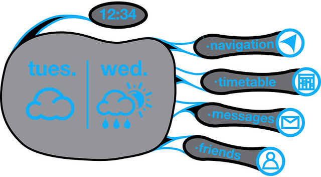
  1. Main Interface: Start with the view of the main interface. Fade in from nothing. The main interface has the options to access the rest of the functions.
  2. Messages: Since the message icon will be illuminated, the user will go to the messages first.
  3. Inbox/Message Shown: From the messages, the inbox is also illuminated, so the user ventures there next.
  4. Reply: The user pressing reply on the previous message will bring up the QWERTY keyboard, allowing the user to reply to the message.
  5. Messages: After pressing the send button, the user can return to the messages menu.
  6. Main Interface: The user then presses the return button again to access the main interface.
  7. Timetable: The user accesses the timetable to view details about the class they are going to next.
  8. Main Interface: Once the user has viewed the timetable, they use the return key to bring them back to the main menu.
  9. Navigation: Now the user accesses the main part of the interface.
  10. Input Destination/QWERTY: The user types in the room that they want to find, followed by pressing the calculate route button.
  11. Map Activation: The Geo-Tool then brings up the map, showing the users location and a route to the destination.
  12. Display Bathrooms: Once the user has the map in place, they activate the bathroom designator, which shows all the bathrooms in the vicinity.
  13. Public Mode: As if showing the data to a friend, the user then shifts their arm and displays the information publicly. The menu options disappear, and the data is simplified down to the basics.
  14. Off: The user closes their hand and the interface goes into stealth mode, still active in the background, but invisible to all.

  15. Compact Interface: The user activates this mode by holding their palm out in front of them and this brings up the bare essentials for navigating. The user then has a few options for enhancing the compass that they have available.
  16. Activate ATM Sub-Arrow: The user activates a sub-arrow, which is significantly smaller than the standard arrow and colour differently. It also has a little icon designating what it is showing.
  17. Activate Bathroom Sub-Arrow: Again the user activates another mode, so now the compass shows three varieties of arrows. The "Alpha-Arrow" showing the current path, the ATM arrow, and the bathroom arrow.
  18. Public Mode: By holding their hand completely flat, the user activates the public mode for the Compact Interface. This makes all the elements of the compass visible to others, but makes the menu options invisible.
  19. Off: The user closes their hand and the interface goes into stealth mode, still active in the background, but invisible to all.
This should be an interesting path that showcases all the best and most interesting elements of the interface.

Saturday, September 29, 2012

DSDN 142: My Pseudo-Code

For coding we have to create a sort of pseudo-code. This is to help us understnad exactly what we want to achieve. The pseudo code is a sort of recipe for planning out our Processing code, that's written in plain English.


Main_Reaction: Plant Growth
{
A plant sprouts from the hill surface.
It grows slowly as its first sun dies.

If Sun_Creation is called,
   The plant grows towards the sun that has been created.
  
   If the plant is close to a sun for a long enough time,
      It grows leaves and a flower.
   Else it splits and grows in two directions.

   If the plant is intersected by the edge of the suns heat,
      It turns to ash and fades away and a new plant grows from its ashes.

Else the plant waits for a sun to be created.


Main_Interaction: Sun_Creation
{
Repeat() {

   The user moves the mouse to the desired location for the sun.
   The user clicks and holds the mouse at said location.
   A sun slowly grows from users mouse.
   The longer the user holds the mouse, the larger the sun grows.

   The user releases the mouse after an arbitrary amount of time.
   The sun now begins to decay and dims and gets smaller.
   The sun disappears.
   }

}

Friday, September 28, 2012

DSDN 104: Modelling Onwards!

Since in the first branch of my tree of models I'm developing a path of models revolving around the idea of creating an impossible shape in 2-D and then making it a reality in 3-D, in the next branch of models I decided I would look at a flat, common shape and make it 3-D, but in a different way to how we normally expect them to.

First, I decided I would look at the humble hexagon, a shape that most of us are intimately familiar with through their notorious use in beehives and futuristic architecture.

I decided to give the shape of the hexagon more fluidity to it by aligning the shapes not horizontally, but vertically into a more sinuous fluid curve.

So I fist looked at how that could be arranged, and then I designed each layer separately, resulting in a total of 7 layers comprising of 19 hexagons, all of which would be stacked in a particular way. The whole idea behind this project is the creation of a (relatively) simple shape which is then used to create something many times more complex, but which still relies on simple geometry to be effective.

Here you get the gist of what I was trying to make. Not having Solidworks at home meant that I created this model in Sketchup, which works well enough. As long as the models are ultimately made of extruded forms, the files transfer to 3dsMax okay.

Here you get the idea of me trying to create much more complicated forms out of very simple shapes. Despite only using hexagons for this model, the shape that I came up with possessed far more form and flow than what exists in the simple 6-sided shape.

After completing the model, I took it into 3dsMax and successfully made it into something much prettier. I call it the Hexa-Core. It is one of those forms which revolves around this idea of something being contained on the inside. I placed lights inside the model to also convey this effect.

Once again, I played around with some simpler changes in 3dsMax, resulting in a slightly less geometric form, but one that still conveyed what I wanted to communicate.

Currently one of the branches in my model tree is taken up by self-contained loops (The Quadra-Knot and the Penta-Knot, while the second branch is taken up by more self-iterative work, like this one.

DSDN 104: A Little Materials Study

So I got a little bit into materials the last time, but they didn't really end up working for me and just looked a little shit. Let's face it. They really did. I am of course talking about these two suckers here:

 Bad, by Sebastien Voerman

Worse, by Sebastien Voerman

The thing is, in reality they aren't bad images, and the colours and actual content are awesome. It's just that they don't really work on a model like this. So I decided it was high time to look at some actual materials that I really like, that are both interesting and beautiful standing on their own.


Glass is great. Seriously. This stuff is so cool. I love it, because it means when I render with it as a material, I get to do funky stuff with the lighting settings and whatnot. The material itself though is just fascinating on its own. It's transparent, can have a myriad of different colours, and does amazing things with the light.

As for when we actually 3-D print, I really have no idea what our models are going to look like. They may be semi-clear, they may be completely white. I've heard they're more likely to be a white colour. Another material that I could be looking at for more precedent materials is frosted glass.


Interestingly, this image is actually a render. I genuinely couldn't tell until I actually visited the source website. The frosted effect is really quite beautiful, and especially with colour it makes the whole model much more dynamic. This could definitely be something to explore. Not sure as of yet how to generate a frosted glass look, but I could figure it out/ find some tutorials.

Another material that I find really beautiful but is astoundingly common on rendered models is chrome. This striking metal has a beautiful effect, and often creates gorgeous reflections of itself and other models. Could be something to try out. 


It's just got that very desirable reflective quality to it. Something about metal just makes it seem precious. It's also got the weight element that makes it very special and often associated with jewellery as well as heavy construction. Now obviously I know it wouldn't be possible to make my 3-D model out of metal, but giving it a chrome finish with spray paint would be possible.

Either way, lots of cool materials and awesome inspirations!

DSDN 142: Interim Code Submission

So, this is the code as it stands presently. Still a lot to do, but I know what I have to do, just not how. But I'll figure it out, for sure. I really enjoy creating the suns, but it will be so much better once the plant has been coded and added.


DSDN 142: Storyboarding The Solar System

So, since for the interim hand-in I haven't got completed code, I have come up with a storyboard detailing how I want the interaction to progress. I want the plant to feel really vulnerable and quite delicate, so the user has a feeling of resposibility for the little 2-D creation.

Storyboard 1
At first the plan grows very slowly, because there is no light around. The little things grows and shows its meagre beginnings.

Storyboard 2
The user creates the first suns, and night on immediately, the palnats growth accelerates. A noticeable change happens in growth too, since the plants now starts to grow to the nearest, largest sun. I branches off at randm points, so as to seemingly attain even more sunlight.

Storyboard 3
The more suns are created, the faster the plant grows. It reaches high into the heavens to get closer to the precious sunlight. The conditions are almore right for the plant to bloom. It jsut needs a little bit more light and then it will be perfect.

Storyboard 4
A perfect sun! A large celestial being that will provide tremendous amounts of energy before it expires! The plant reaches higher and higher as the user with the cun-creating hand lets the sun grow. The plant has enough energy now to sprout a flower and maybe some leaves.

Storyboard 5
And it blooms! The plant can create what it has always wanted to create! It seeks the light with its petals, and the little leaf harvests all the solar rays it can.

Storyboard 6
But no! What is this! A burning celestial entity has been created half way down the stem, and the plant begins to be cooked. Slowly as the solr rays reach the critical point its stem turns to ash and the plant disentegrates. But from the ashes of one plant, another is born.

Full Storyboard

Thursday, September 27, 2012

DSDN 104: Another Model

So, I've been working on the first proper model for 104, and this is it. Continuing on from my model of before, exploring the exposition of something impossible in 2 dimensions that works in 3-D. I created this little sucker here, which would be an absolute nightmare to create in anything other than 3-D printing.

Despite the fact that it was really tricky to achieve and the angles I was working with were tricky at the best of times, I actually really really enjoyed making this little model. There's something about creating something that might be 3-D printed and actually be physical in your hand that is just so flipping cool.


So, I came up with this concept of a pentagon-shaped design, where the shape would look impossible from above, but when applied to a form that is made in 3-D, it's totally feasible.

So I took my sketch and my measurements and translated them into Solidworks. The result here is quite impressive! I also enhanced the shape with some beams that bisect the shape.

Capture
Here the view from the side shows the shape is very much possible in 3-D. Another surprise was that I was able to achieve it without any of the main pieces intersecting! In a way that actually really surprised me because I had a huge expectation that it would cause issues.

To test out how the models might render, I then took them into 3dsMax, and applied some materials, lighting and situations, as well as some modifiers. 3dsMax is a fantastic tool, and it's actually amazing how great it can make your models look. 

Here I took the base model and applied some lighting and a glass material. Because hey, I just love glass in 3dsMax along with the caustics it generates. This is the unaltered model, aside from an applied material.

After the standard model, I tried experimenting a bit and twisted and tapered my model to give it a bit more interest factor. It suits, but I actually almost like the unaltered, more geometric model a lot better. Don't get me wrong, I love this one too! But the other one just feels more like the look I've been trying to achieve.

DSDN 112: Branding My Design

So, after continuing work on my user interface, I decided it would be really really cool to give my whole product/design a brand and name of its own. I also looked at actually coming up with a cohesive design for the brand as well as a colour scheme. Since I've decided on a an organic-type design for the user interface, I wanted this to reflect in the colour scheme.


I'm going to use a two-colour scheme which works alongside a series of grey tones. The blue will be the more general colour for writing and other important things, while the green will be used as more of an accent colour, emphasising the state of individual components (activated) as well as important elements on the map.

The next step is to give the company a corporate identity, something that can be recognised as being them specifically.

Logo Branding

So I decided to create a strong logo for the product, something that could be on the display as it starts up. I incorporated one of the most important icons in the system into the logo as well. The little green arrow is the designator for where you are on the map, and it also conveys the dual-colour element of the design through the logo.

Since I've gone to such lengths to brand the system, it only seemed logical to design the icons that would be used in the program myself.

Elements Branding


For the little icons, I wanted to make them very recognisable. Often, I will use the logos in tandem with the writing, so it wouldn't be a huge failure if they didn't really work out. But that would be silly. If I'm going to this kind of effort, I need to make them something decent. So I have.

An element that I haven't discussed before is including elements like the weather on the home-screen palm, since there isn't anything displayed there. So I figured it would be nice to make a discreet weather forecast for the system.

Weather Designs

I came up with some simple icons for the weather that fit in with the design of the other icons and branding as a whole. For simplicity, in the flash video we make, the weather forecast is just going to be cloudy followed by rain & sunshine.

And so on to the business end of the design. The actual interface screen is very much designed around the shape of the limb, incorporating the natural swings and arcs of the human form. Designing the system for a very specific slate/surface allowed me to connect the elements of the design to specific points on the body, as opposed to random points on the screen.

Branding Design

I wanted to design each component of the design to be isolate from the rest, connected by the sinuous blue bands. The forearm is a separate component entirely, just as the fingers and thumb are. The tethers are designed to be like the individual components of the body, and are meant to make sense. The blue circles on the fingertips are where the icons are going to sit for the interface. The tethers will light up in green when activated, another feature I'll be building in.

The home screen (which doesn't incorporate the forearm) will be made up of 6 components: Time (Thumb), Navigation (Index), Timetable (Middle), Messages (Ring), Friends (Little), and Weather (Palm). The time function doesn't change throughout the other screens, so that part will be staying constant.

Branding Homescreen

The home screen serves as a point of reference and activation for all the other functions. It is the trunk of the wireframe. Curling any of the fingers will bring up that fingers function.

So, successful branding, while not crucial, I believe is an important part of my design.

DSDN 142: Enhancing and Furthering

So, since I've got my sun creation under control, I now turn to combining the different elements I have so far for the interim hand in. So far I've managed to combine the sun and the asteroid surface, which surprisingly wasn't nearly as easy as I anticipated.

Another problem I had to overcome, which is actually quite a basic, simplistic element of the code, was understanding why when I wanted to activate the saveFrame() function, it wouldn't work quite as expected.
The realisation that it was just an extremely simple element of the arrangement of my code actually made me feel quite stupid.

I've slightly adjusted the height of the arcs at the bottom that form the planet, because I want to give the plant more space to grow and I want to give the user more room to create suns with.


This is the current look and feel of the space. I am a little bit disappointed with the colour of the planet on this screen though, because on my screen at home, the planet is much browner, which is what I want. Damn RGB incongruencies...

DSDN 104: Early Model Fun!

So, I decided to work through one of my preliminary sketches, and it actually was relatively easy to create. I cried a little bit dealing with some elements of Solidworks, but on the whole it was very manageable. The sketch I turned into a 3-D model was the one I've nicknamed the Quadra-Knot. It's actually a rather cool shape, but one of the problems with it is that it's just not good enough to be even close to a final model yet. Oh well. I'll get there. I've got lots of ideas!

Forming the Quadra-Knot in Solidworks, I had some difficulty getting the Swept Boss function to work, but thanks to a little help form my tutor, I got what I wanted in the end. Once I had finished the model, I took it straight into 3dsMax to render some materials on it.


Image acquired from: http://hdw.eweb4.com/out/422971.html

After applying a UVW map onto my model, I applied one of the inspiration materials onto it. The material that I applied was the hexagonal one, and it turned out quite well!
The hexagons worked quite well in combination with the UVW map because I applied it spherically, since the other methods of applying it really didn't work too well.


Then, coming back for seconds, I decided to try out a less uniform material on the model. I took the one of the desert sands and overlaid that on the model too. It turned out alright!

For the desert image, I had to apply the map in a planar direction, because it was coming through all spliced together all over the model. Weird. It's the same model...


And then, pretty much just because I could, I went and rendered the model in glass. Because I really like glass. As you can no doubt tell by my past two final renders for this course. It just renders so beautifully!

Wednesday, September 26, 2012

DSDN 104: Material Precedents

So, for this project, we also have to scout out some interesting material precedents. Since I'm looking at using strong patterns and geometric forms to create my model, for the material choices right now it might be really nice to offset that geometric perfection with some more visually interesting materials.


The sand dunes in this image are very interesting, as the shading on them provides a distinct element of depth and gives the 2-D image implied form. The shapes formed in the sand by the wind and weather feel like they could be at the bottom of the ocean, and while they are anything but geometrically perfect, they still provide a very intriguing material pattern.


In contrast, this material here is totally geometric. Amplifying the geometry of the form with a geometrical material, while possibly a bit of a double up, may actually assist the geometric form in creating the sense I want to achieve.


This material here is just awesome. I love the night randomness of its creation. I'm not even sure what it actually is. Actually, I just found out it's been done on paper, via "mark-making". It could be rust for anyone else without knowing. The wash of colours is really great, and it just carries a much more chaotic feel than either of the previous two.

Image acquired from: http://chuchl.com/blog/?p=1201

This texture harks back to a little bit more of structure, however, saying that, the stones are all different shapes and size, and this makes the pattern and materiality of it quite interesting. Looking at this surface, this would be something that I'd like to walk on. It's smooth and yet chaotically rough at the same time.


While I did use this form for my actual precedents, I think it's also very relevant to a materials choice. The geometry of this overlaid on a rendered model would be a lot more forgiving than the squares of the previous geometric material. The variation in tones also means that this material would be more interesting as a texture.

DSDN 104: Sketches & Ideas


So, I've done some sketching, which is really crucial as it will quite possibly decide the future of where I'm headed for this project. The inspiration for all of these sketches came from the precedents that I discussed earlier. The actual inspiration for each piece is slightly different. Some of them aren't so much sketches of potential models so much as sketches of motifs that could be used in my models.

Sketch 1

The inspiration for this one was from the dandelion flower, where you can very clearly see the Fibonacci spirals emanating from the centre of the flower. The seeds are arranged in a very oddly mathematical sequence, and it raises the question of them being designed by some sort of grand maker. Not that I believe in such stuff. But anyway, the spirals emanating from the centre could be a very important motif, and I don't think it should be a design I take on lightly.

Sketch 2
Translating that spiral into a 3-D form therefore seemed very natural, and deriving it from the original shape of a plant that adapted this for wrapping itself around other plants just seems like a logical step. The vertically translated form could be a very powerful part of my model and give it the verticality it needs.

Sketch 3
Using the honeycomb design, which is so simple! It's such a beautiful series of shapes and they are so strong and integral to the design of beehives.We have started to adopt such forms into our own architecture now, which I see as a definite step in the right direction. Drawing inspiration from nature for this project could however become my undoing if I'm not careful with it and how I design it.

Sketch 4
Drawing from Grecian design after taking 171, the design history paper last trimester almost feels like a step backwards, but the designs that the Greeks came up with are both elegant and beautifully simple at the same time. Why I haven't used such designs in my work before is a mystery. Another thing I want to pursue is the notion of making something that in two dimensions looks physically impossible possible in 3 dimensions. If that makes sense.

Sketch 5
Taking the prior Grecian design and making it into something a little more fluid is an interesting step, as it allows me to play with some of the curvature a little more. Making something that could look like a piece of string would be really cool and could definitely stand out from the rest. Understanding how the design works is key, though.

Sketch 6
Being able to stack such a design and replicate it vertically could be invaluable to expanding the design in the third dimension. I want to make maximum use of the capacities of the 3-D printer, so I need to make sure I stretch it to its absolute limits. Possibly making something that could look like a machined component could be cool?

Tuesday, September 25, 2012

DSDN 142: Enhancing the Radial Gradient

So, after intense work with my tutor, we managed to combine my solar entity creation function with an array,  so that it would allow for multiple suns to be created at any one time.

One of the main problems we had was getting the system to reset the value for the size of the sun each time a new one was created. In the end we solved this and have 4 arrays that decide the creation of suns. This now allows the user to completely create each sun from the beginning. The suns still slowly get smaller and smaller, and then disappear. It's great. :D

They looks really good as a collective too, and now I've just got to combine them into the environment. Another step on the list of doom down! 


They almost remind me of colourless fireflies! Or maybe a parade of alien spaceships.


They have an omnipresence in a way, a feeling of silent watching and waiting. And also they still seem like they are moving to me.