
I'm going to use a two-colour scheme which works alongside a series of grey tones. The blue will be the more general colour for writing and other important things, while the green will be used as more of an accent colour, emphasising the state of individual components (activated) as well as important elements on the map.
The next step is to give the company a corporate identity, something that can be recognised as being them specifically.

So I decided to create a strong logo for the product, something that could be on the display as it starts up. I incorporated one of the most important icons in the system into the logo as well. The little green arrow is the designator for where you are on the map, and it also conveys the dual-colour element of the design through the logo.
Since I've gone to such lengths to brand the system, it only seemed logical to design the icons that would be used in the program myself.

For the little icons, I wanted to make them very recognisable. Often, I will use the logos in tandem with the writing, so it wouldn't be a huge failure if they didn't really work out. But that would be silly. If I'm going to this kind of effort, I need to make them something decent. So I have.
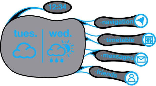
An element that I haven't discussed before is including elements like the weather on the home-screen palm, since there isn't anything displayed there. So I figured it would be nice to make a discreet weather forecast for the system.

I came up with some simple icons for the weather that fit in with the design of the other icons and branding as a whole. For simplicity, in the flash video we make, the weather forecast is just going to be cloudy followed by rain & sunshine.
And so on to the business end of the design. The actual interface screen is very much designed around the shape of the limb, incorporating the natural swings and arcs of the human form. Designing the system for a very specific slate/surface allowed me to connect the elements of the design to specific points on the body, as opposed to random points on the screen.
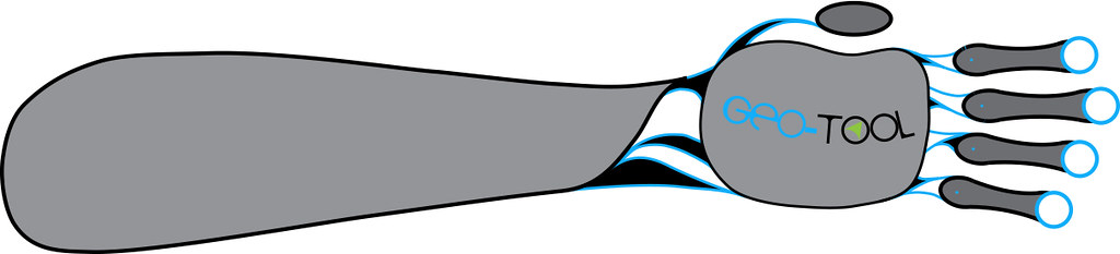
I wanted to design each component of the design to be isolate from the rest, connected by the sinuous blue bands. The forearm is a separate component entirely, just as the fingers and thumb are. The tethers are designed to be like the individual components of the body, and are meant to make sense. The blue circles on the fingertips are where the icons are going to sit for the interface. The tethers will light up in green when activated, another feature I'll be building in.
The home screen (which doesn't incorporate the forearm) will be made up of 6 components: Time (Thumb), Navigation (Index), Timetable (Middle), Messages (Ring), Friends (Little), and Weather (Palm). The time function doesn't change throughout the other screens, so that part will be staying constant.
The home screen serves as a point of reference and activation for all the other functions. It is the trunk of the wireframe. Curling any of the fingers will bring up that fingers function.
So, successful branding, while not crucial, I believe is an important part of my design.
No comments:
Post a Comment