Sunday, December 22, 2013
A Drawing A Day: Day 8
Managing to squeeze in sketches is tough, but I'm enjoying the challenge of doing something and getting it out to the internet. I don't know if anyone actually reads this blog at all, but the something thousand page views can't all be bots, surely?
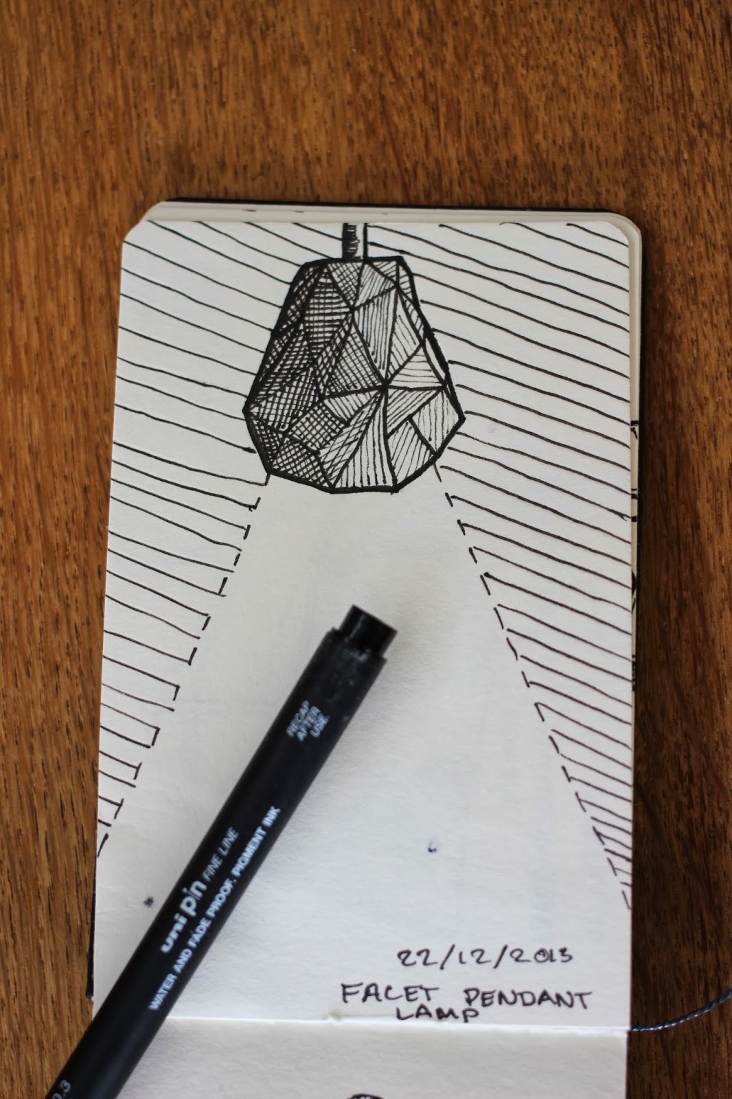
This sketch is one of my favourites so far, and I' really like the form it takes. It's given me quite a lot of ideas for my next venture. My next venture is to start doing some work and setting up a shop in and selling from Etsy. I'm sure you'll hear about that in due course, when it starts to happen. This sketch was mostly inspired by my faceted gemstone sketch, and I wanted to turn it into something more designer-ly, and make it something useful. In this case, it's a lamp!
Saturday, December 21, 2013
A Drawing A Day: Day 7
Sketching is getting a little harder each day, but such is the nature of this time that I'm working. I work at a small restaurant/theatre just down the road from where I live. The business in this place focuses and gets heavier around the Christmas period, and having time for other things can become quite taxing. Sketching is most likely going to fall apart directly after Christmas, but hopefully I will pick it up again as soon as possible.

Today's sketch is a very conceptual idea about a table which is inspired by a piece of crinkled paper. I'd love to be able to create a piece of furniture like this that has very subtle changes in the surface that might not be immediately obvious at first, but if one stands back could provide a strange light play across the surface. The slight variance in angles and shapes of the table could be an interesting talking point for users as well as a way of dividing the space between the users.
Today's sketch is a very conceptual idea about a table which is inspired by a piece of crinkled paper. I'd love to be able to create a piece of furniture like this that has very subtle changes in the surface that might not be immediately obvious at first, but if one stands back could provide a strange light play across the surface. The slight variance in angles and shapes of the table could be an interesting talking point for users as well as a way of dividing the space between the users.
Friday, December 20, 2013
A Drawing A Day: Day 6
One of the things that I did this year was acquire a Wacom tablet, which I plan to make good use of this year trying out sketching and drawing digitally. One of the things that I really want to get into is the process of designing and drawing landscapes. I'm not a huge fan of characters, but I really love landscapes and cityscapes in concept art. They're something I really want to get better at, and achieve more in.
 A simple sketch, this one, but I really wanted to just try out some things. I wanted to see how some shapes would translate into a city-like form.
Thursday, December 19, 2013
A Drawing A Day: Day 5
I took a bit of a different route today, and decided to do something of a video game sort. I love the amount of effort that video game companies and film companies put into their weapon design, so I decided to try my hand at something. Aaaaand it looks like a nerf gun. I went way too over the top with it, and it doesn't look threatening at all. I think I'm going to give this another go at a later date, see how it goes then.

It just looks a bit too stocky and far too chunky to work as a serious weapon. Oh well, sketching will continue!
Wednesday, December 18, 2013
A Drawing A Day: Day 4
Today I tried my hand at something a little more methodical and technical. I went and decided to sketch a feature bookshelf at my girlfriend's place. The bookshelf has a really awesome structure that looks really simple, but when you actually try to draw it, it's any but simple.
The intersecting lines and multi-levelled form makes for a very hard thing to sketch, especially if you decide to do it in two-point-perspective, as I did. The repeating pattern can actually make things more difficult when you do the drawing in two-point, as the front-most parts can overlap in ways you don't expect. I actually had three previous goes at the sketch, but it resulted in a big ol' mish mash of lines. I found the best way to do this sketch was to draw the lines in the foreground, and then work everything out from those lines.
 The bookcase itself is a lot of fun to look at, and I enjoyed the challenge of sketching it!
The intersecting lines and multi-levelled form makes for a very hard thing to sketch, especially if you decide to do it in two-point-perspective, as I did. The repeating pattern can actually make things more difficult when you do the drawing in two-point, as the front-most parts can overlap in ways you don't expect. I actually had three previous goes at the sketch, but it resulted in a big ol' mish mash of lines. I found the best way to do this sketch was to draw the lines in the foreground, and then work everything out from those lines.
Tuesday, December 17, 2013
A Drawing A Day: Day 3
I recently acquired a rather lovely piece of Industrial Design, in the form of a new water bottle (I needed one!). If you guys haven't definitely check out Kor, they make fantastic drink bottles that are awesome, affordable, and just look great. That, and they also almost always run specials on pricing, which is kind on the wallet (or not, depending on how you look at it!).
 I actually drew the sketch of the water bottle before the bottle arrived through the delivery, drawing the shape and form from memory of the picture of the bottle design. That's why it looks a bit different to the photo!
 I really enjoy using the small lines and hatching to create form and value. It's a fun way of implying depth and shade. Yum. Glug glug glug.
Monday, December 16, 2013
A Drawing A Day: Day 2
This sketching is also giving me a chance to run in my new lens on my semi-new camera. I'm using a 40mm fixed-length lens with f2.8, which is proving to be an awful lot of fun. It's got a fantastic depth of field, and takes stunning portrait shots, as well as pretty good close-ups.

The sketch for today was all about creating depth and form through shading. I loved this gemstone drawing I found on Pinterest, so I decided to do a much more basic version of it, using purely lines to create shaded areas versus non-shaded areas. Definitely going to experiment with this technique a little bit more.

The sketch for today was all about creating depth and form through shading. I loved this gemstone drawing I found on Pinterest, so I decided to do a much more basic version of it, using purely lines to create shaded areas versus non-shaded areas. Definitely going to experiment with this technique a little bit more.
Sunday, December 15, 2013
A Drawing A Day: Day 1
So, to keep myself busy over the holiday period, I've decided to get my sketching up to scratch, so as to make the time I spend away from uni a little bit more worthwhile for my future. Gaming has a lot of perks in the fun department, but in terms of actually contributing to my future, maybe a little less so. Oh well, one can't always be perfect, isn't that the case?

Life kind of trudges along at it's own pace, but I kind of wish a little bit that I was back at university already. Seems a little bit strange, I know, but I enjoy the challenges that it poses me. Work and family life isn't challenging in the same way. I'm looking forward to being done with my degree and actually doing work in a field that works for me.

Life kind of trudges along at it's own pace, but I kind of wish a little bit that I was back at university already. Seems a little bit strange, I know, but I enjoy the challenges that it poses me. Work and family life isn't challenging in the same way. I'm looking forward to being done with my degree and actually doing work in a field that works for me.
Monday, November 25, 2013
INDN 212: Featured!
So, my team and I today got featured on the awesome design blog Yanko Design today! I'm so stoked! Check out the link on Yanko to see more!
Friday, November 8, 2013
INDN 212: Videographical!
We created a video to show how our design worked, as well as the research behind the sizes. I think it's neato. That, plus Cole does an excellent job of playing the subtle star, while Ash and I did all the work behind camera. You should definitely check out Cole's blog here: http://coleholyoakedesign.tumblr.com/ and Ash's blog here: http://amsdesign-indn212.tumblr.com/
Thursday, November 7, 2013
INDN 212: Vertical Garden Design Presentation Slides
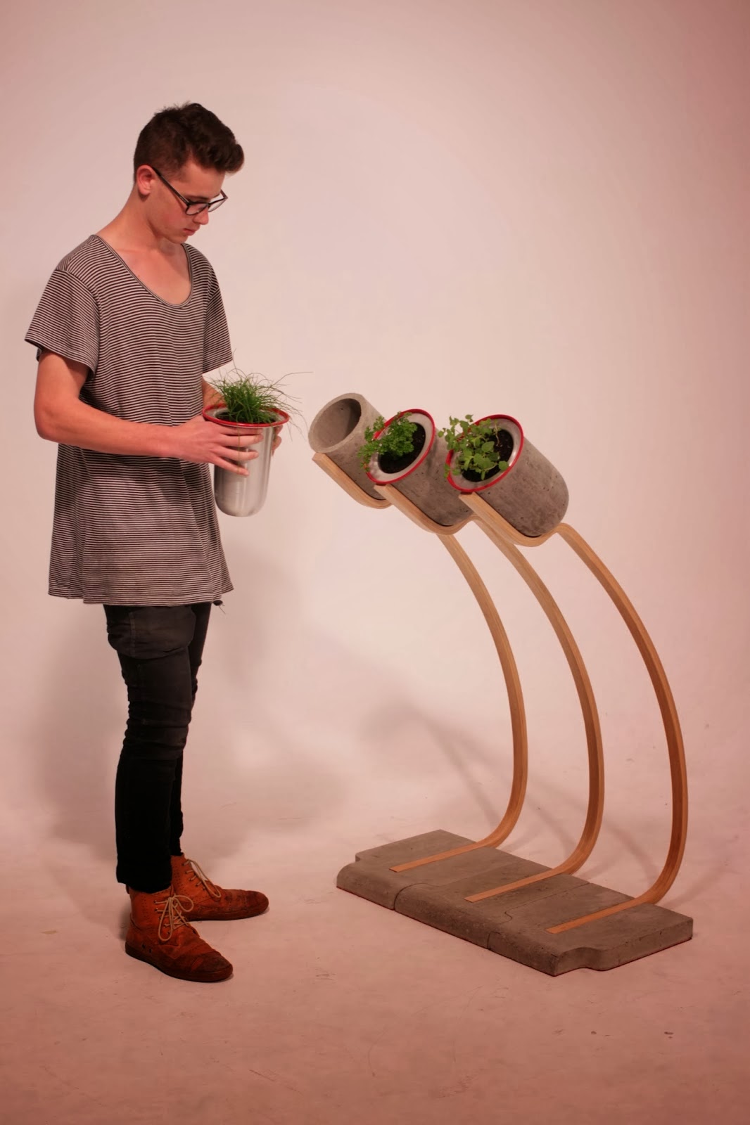
These were the final presentation slides for our group project Urb-Garden, a project based around bringing herb gardening into the home in a sculptural, aesthetic way. The primary focus of the project was centred on making something that would alleviate back pain in avid urban gardeners. The design was developed extensively over a 3-week period, whereupon we began the production phase, which lasted 3 weeks. The final design is something we're really proud of, as it fulfils the function we set out to devise, as well as being a very aesthetic piece that speaks of simplicity, but upon closer inspection, reveals a far more extensive development in production and assembly techniques.
 The final piece consisted of three iterations that fit together in a puzzle-like fashion. Designed as modular pieces, the design would allow users to choose as many as they felt were necessary. The base and attached pots were made in fibrous concrete, to ensure the best strength to weight ratio, while the stems were made of steam-bent laminated strips of Ash, an extremely strong and beautiful yet labour-intensive solution. We then had aluminium pots spun by a professional metal spinner that would fit into the concrete pots.
 We wanted to create a highlight on the design itself, so we spray painted the very edges of the metal pots red, a colour we also duplicated in the felt we used on the base of the concrete. This colour is both striking as well as beautifully contrasting with the green of the plants, an effect we chose intentionally.
 What we ended up creating was a piece that was quite dynamic and had a good flow of usage, as well as a really quirky motion that made the whole feel quite lively. This, combined with the red accents, made the Urb-Garden a really satisfying design.
 The last element that we wanted to include in the presentation was the idea of there potentially being a "collection" of different types of Urb-Gardens. This particular variant that we designed was all about being free-standing as well as providingeasy access. We had ideas for alternate variants that could be plays on the original, with one idea being a smaller version that could sit on a table or bench if the user had limited floor space. Alternatively, if the user wanted a more permanent installation, we devised a wall-hanging variant, whereby if the user had a more permanent residence, they could make a more permanent change.


Wednesday, November 6, 2013


Tuesday, November 5, 2013
MDDN 242: Sky Climber
So, my game is complete! And it proved to be a lot of fun. Even though a horrible atrocity befell me three nights before the hand-in (I lost all my code due to my losing my hard drive), I managed to pull through with a little help from a stiff drink and some pumping tunes.
 One of the simplest aspects of the game that I find the most compelling is the parallax effect that I generated for the various layers of the game. I wanted to give the game a much more interesting depth to it than is normally possible in a 2D game.
 The entire experience was designed to be dynamic. The instructions fall away as you master the mechanics of the game, and the sun drifts down in the sky as you travel higher. Soon you grasp how quickly you're moving vertically as you hit the clouds though.
 Most of the clouds are in the distance, while others are in between the viewer and where the game takes place, occasionally briefly obscuring the game, making things harder for the player. The clouds all move at different speeds, highlighting the sense of depth.
 The game gets progressively harder, as the gravity constant begins to skew. It starts to make the ball fall faster, while the ball's rebound gets stronger, ensuring that the height the ball bounces stays constant.
 I went for a very minimal aesthetic with the game, letting strong colours and shapes do the talking more than anything.
 If there was one thing I wish I could have done to add to the game, it would have been to add a high score recorder, as the game actually got taken quite competitively in the in-class test. I loved this project, and I'm actually fairly disappointed that there isn't going to be a third-year coding class. Oh well, that's what free time is for, right?
Tuesday, October 22, 2013
INDN 212: Early Contributions
The design that we'll end up with is definitely not going to be any one of these, but I still like seeing my process abound on my blog. And I feel like the process involved in this project is HUGE. We've gone from design to design to design. And it still gets better with each step.


Friday, October 18, 2013
CCDN 231: Project 3: Onion Meditation
So I ran my little guided meditation experiment yesterday, and it was a huge success. The tutors loved it, and I think they really appreciated getting to do it at the end of the day, after an immense volley of crazy, whacked out experiments. In a way for that I'm quite glad that mine got postponed till the end of the day.
The experience harmonised the intense sensory experience of chopping an onion with a meditative practice, creating a new amalgam of the two.


The experience I have created harmonises chopping an onion with meditation to create a sensory envelope around the subject. Following on from the previous revelations surrounding the subjects sensory and mental involvement with chopping the onion sans tools, I sought to refine the overall encounter into something that transcended that everyday task. By removing the task element and reinventing the surroundings, I was able to restore a balance where the subject is both fully immersed in the sensory and mental onion adventure as well as able find an inner peace through a guided meditation. Invoking an evolution in the experience by removing the subjects sight allows for a more visceral and engaging event, and encourages alternate avenues of personal reality crafting. “…some find (meditation) difficult and austere. Most lack the patience to persist.” (Brown & Gerbarg, 2009). Channelling this practice into an event that combines the pure and focussed element with a sense-heavy, everyday experience will allow the subject to test a strange, novel amalgam of the individual elements.
This compound ordeal was led by an “austere authority”. The idea of creating the austere authority is suggested by Middlebrook through removing the biological, sexual, and chaotic aspects of a figurehead, leaving behind one whose biology is covered by an imagery of chastity, prudence, or purity nigh unattainable by the average citizen (2001). This austere authority leads the subject through the process and experiences expected from the onion meditation. The authority and respect was commanded from the very beginning right through till the last minute, from the most mundane aspect of removing their shoes to guiding the subject in fulfilling the experiential side of the onion chopping. Brown suggests that the authority speaks with knowledge of the experience that the subject can only aspire to, and that ambition to realise their potential as the authority has results in increased respect for the authority (2009). This representation of knowledge in a non-aggressive, semi-passive way allows the subject to feel led as opposed to subjugated.
The actual task that the subject had to complete was centred on the idea of created experiential minimalism. Just states with respect to Raymond Carvers minimalist short stories that “the author shows the resultant aesthetic effect of these techniques (utilizing simplistic, unstylised and clumsy situations) is a paradoxical coexistence of heightened realism and a blankness of meaning.”(2008). Through removal of tools and the simplicity of the task, I allow the subject to viscerally experience the onion and enjoy the pure sensory engagement in a blank environment. This removal of extraneous thought processes and distractions allow the subject to realize the sensory experiences in better detail than before, creating an enjoyable and novel encounter. This subversion of austerity as something that could be enjoyed rather than abhorred is connected to more stylish minimalist sentiments. Ultimately, we enjoy the novel experience of simplicity, even if the task ends up being far more difficult. This faux simplicity masks our overindulgence and complex existences. (Busch, 2007)
The purpose of the removal of the subject’s sight part way through the experience was to elicit a heightened sensory response in the remaining 4 senses. The Acoustical Society of America observes that enhanced sensory abilities begin to occur almost immediately after the onset of ‘blindness’. The heightened senses reach a peak a few minutes after the onset of ‘blindness’, and from then on, the subject gets better based on their ability to learn how to appropriate their remaining senses to understanding the world around them (2012). This shift was where the meditative experience becomes refined and encourages the subject to experience the space around them in a unique way. This makes the task more difficult, but as stated before, we enjoy challenging situations, even if as a whole they are presented as being simpler in theory. This imposed austerity of the senses allows the subject to create their personal realities in a different, powerful way. The University of Southern California’s study has confirmed that sight and touch have a much more established link than before, and that the “mind’s eye” is a very real tool (2011). This scenario allows for the austerity of perception to be counteracted, causing the austerity to result in a new, rich experience.
The final aspect of the experience that defined it as austere was the environment. The environment provided a blank slate for the subject to impose their realisations onto. I wanted the blank slate to be re-written visually, aurally, and through touch. To achieve this, the onion meditation was located in a white, clean space, with bright lighting and no embellishments. The ability to focus on the task at hand, but not have to think about it is where this non-task comes into its own. In his poem Meditation Caves of Tibet, Fred Dings writes:
“So they entered
the heart of the rock to watch the rise and fall
of their own breath and to let all thought
sift from the clarity of their being,”
(2012). Dings describes the weight of the world around the Tibetan Monks being realised and understood, and the space of meditation being of incredible importance to the process. The choice of location was made to emulate a similar sense of the “heart of the rock”, as the ergonomics lab has a certain heaviness to the feel of the room, which elicited a similar response in the subject.
Ultimately what I wanted to create was a diverse experience that made the subject feel the sense of austerity in the task they completed as well as in the methodology behind it and the environment it took place in. The breaking apart of the onion assumes an entirely different role in the meditation, being transformed into something where the user is encouraged to feel the onion and revel in the sensory experiences that accompany it. It ceases to be about the goal of having a completed, chopped onion, and becomes more about the journey to that point and the sensory elements in it.
Bibliography
Acoustical
Society of America. (2012). 'Blindness’ may rapidly enhance other senses. ScienceDaily.
Retrieved from http://www.sciencedaily.com/releases/2012/05/120508152002.htm
Attfield, J. (2000). Wild Things. London: Berg.
Brown, B., Chandler, J. (Ed.), Davidson, A. I. (Ed.). (2009). The Fate of Disciplines. Critical Inquiry, 30(4), 1032 – 1053. doi: 10.1086/599589
Brown, R. P. and Gerbarg, P. L. (2009), Yoga Breathing, Meditation, and Longevity. Annals of the New York Academy of Sciences, 1172, 54–62. doi: 10.1111/j.1749-6632.2009.04394.x
Busch, A. (2007, July/August). Excess Disguised as Less. Print Magazine, N/A.
Dings, F. (2012). Meditation Caves of Tibet. World Literature Today, 86(4), 13. Retrieved from http://search.proquest.com/docview/1288665704?accountid=14782
Gambrel C. G. & Cafaro, P. (2009). The Virtue of Simplicity. Journal of Agricultural and Environmental Ethics, N/A. doi: 10.1007/s10806-009-9187-0
Just, D. (2008). Is Less More? A Reinvention of Realism in Raymond Carver's Minimalist Short Story. Critique, 49(3), 303-317,333. Retrieved from http://search.proquest.com/docview/212427944?accountid=14782
Middlebrook,
L. (2001). "Tout mon office:" body politics and family dynamics in
the verse epitres of marguerite de navarre. Renaissance Quarterly, 54(4),
1108-1141. Retrieved from
http://search.proquest.com/docview/222426307?accountid=14782
University of Southern California. (2011). Scientists probe connection between sight and touch in the brain. ScienceDaily. Retrieved from http://www.sciencedaily.com/releases/2011/09/110908141443.htm
University of Southern California. (2011). Scientists probe connection between sight and touch in the brain. ScienceDaily. Retrieved from http://www.sciencedaily.com/releases/2011/09/110908141443.htm
Friday, October 4, 2013
MDDN 242: Stellar Mountains
And now I have it! After experimenting with various options, I decided to take the path that allowed the users to influence the mountainous structure, but then have a visual display at the same time that would allow them to understand how they were influencing the curve. I made a blue line that pulses across from left to right, but that also still exists statically, that the user can move and manipulate and actually see how they are affecting it.
At the same time, this blue line is a feature piece that only exists when the mouse button is held down, embodying the idea of a temporary, ever-changing beauty, as when released, the line fades, making way for the web to again be the centrepiece. I really like how it's turned out, and the forms you can create with it look really beautiful. They remind me of nebulae and galaxies in space.
"Instructions:
Click and drag the mouse to influence the mountain-forming curve. Depending on how your mouse moves, the line changes in a particular way. Press the buttons to reset or clear. The interaction works best with a slow and heavy hand on the mouse movements, holding down the mouse for a long time and moving it around slowly.
With this project, I sought to create a dynamic, abstract form generator that could be influenced, rather than controlled, by the user. I wanted to create something with a very simple aesthetic, that both exemplified and hid the complex elements. I also wanted the user to have the ability to see how they were influencing the line, while at the same time still maintaining the pure web-like layering that makes the whole thing beautiful. The resultant piece I wanted to form like a mountain, or if the user pushes the code to the limit, look more like nebulae in space.
I meant this code as a generative piece, and I wanted to allow the user to save their "creations". The interesting aspect of the interaction as a whole is that every user starts out not knowing how it works, and by the end of the interaction, everyone has a certain way they like to manipulate the piece and a certain result they enjoy seeing."


Above are shown various forms that can be created with the program, and below is the link to the code that you can play with. Have a go! Make something pretty!
Stellar Mountains by Sebastien Voerman
Tuesday, October 1, 2013
MDDN 242: Adaptation Is The Best Remedy
So, the direction that I want to take this project now is more along the lines of wanting to allow the user to influence the structure and growth of the structure as a whole. I don't want the user to feel like they have complete control, but rather that they are having a tangible, not quite understood effect on the generation of the scape.
 One idea that I've begun to play with, which I quite like, is the addition of random blue quads, which I think have the potential to enhance the form itself and give it more interesting elements of depth. Another part I built in here was a shaded layering effect, where I had the curve creating the mountain shifting as well as changing shade at the same time. It's a little bit too strong in this one, but the next one conveys it nicely.
 Here the shift is a little bit slower and hence easier to see. The blue quads here made a really interesting form, but I toned them back a bit so that the web was still the star of the show. That's what I really put the work into, so I feel that would be more worthy to show off.
 After experimenting with darker shades, I decided to switch to white, so that my forms could be very clear cut, as well as allowing the reference to the mountain to be more tangible. One important aspect that I built into this form was the use of a third curve. The first is responsible for creating the top-most form, and giving the mountain exterior structure. The second curve is responsible for filling out the mountain with very light, interspersed connection points and lines. The third and final curve that I built in creates highlight structures on the mountains, creating the illusion of valleys and a 3D nature.
 This is the same code as before, but less chaotic and more controlled, as well as earlier in the cycle. I think the blue quads are starting to be more distracting rather than useful, so I think I'm going to edit the code. I have some really cool ideas for where to take the code now that I have the user input as the mouse. This input influences the curve in different ways depending on in which direction the user moves their mouse. I also plan on building in a GUI, so that the user can reset the generation, or alter the curve and have the generation restart with their custom curve. I also want the user to have the ability to save their frames, so that they can have something interesting come out as a saved file.


Wednesday, September 25, 2013
INDN 212: The Heat Indicator/Board
So, I have 90 seconds to present, eh? Elevator pitch? I can do that. I hope.
 This is a person like me. I burn myself inadvertently on hot pots and pans all the time. It's gotten to the point where I will actually hurt myself and it's no longer funny little incidents. You'd think I'd have learnt by now. But no.
 The initial element of my idea is to create a strip for a pot that essentially displays whether or not the pot is currently hot. This visual cue could also be very easy for parents to teach their children to observe. Keeps the cue very high, but the intrusion on form minimal.
 I wanted to expand this into something more, something that would actually work as a standalone product. I devised an idea for a heat-measuring food presentation board. It would serve as a board for a hot pot, as well as a display for the heat of the pot in an appealing, aesthetic way. I also wanted to combine it with multiple other functionalities that would allow the board to do more than the heat strip would.
 While the pot-based heat strip would be super simple, this board would tell the user how hot the pot is, which could be used to both optimise serving temperature, as well as a further warning for individuals contemplating touching the pot. The board could be a self-contained unit, turning on when the pot was placed down, as well as turning off once the pot was no longer hot. The board would also be used to hold other condiments/additives for the meal.
To make this project come to life, I'm going to need: people with skills in Arduino programming, people with a good sense of form and aesthetic (Which I know all of you are, otherwise you wouldn't be here!), and people with a great knowledge of materials and construction/production techniques.


To make this project come to life, I'm going to need: people with skills in Arduino programming, people with a good sense of form and aesthetic (Which I know all of you are, otherwise you wouldn't be here!), and people with a great knowledge of materials and construction/production techniques.
Subscribe to:
Posts (Atom)