Tuesday, April 30, 2013

INDN 211: Project 2 Personae

So, the next logical port of call is to come up with some refined personae who would use my product to achieve a personal goal or to acquire a skill they never learned.
This chap looks a little odd. Looks like he might be auditioning for a beauty competition. Ah well. This is the more professional target persona, and for this person, the aesthetic of the tool might be a little more important than how well it works.

Obviously this guy doesn't want it to be obvious that he's suffering with mundane tasks following his accident/stroke, so making the product subtle and appealing would be important to him.

The idea of independence keeps popping up between all these personae, and it seems that this is very much the driving force behind the project for me. No-one wants to rely off others. Everyone wants to be able to stand tall on their own and show the world what they have to offer.

And so they should! Everyone should have the opportunity to succeed at anything they put their mind to. And that's what I want to facilitate.

Coming from a less educated community demands a different skill set to our Westernised society, and can often pose problems for people want to immigrate. Wanting to assimilate oneself into a developed community demands a certain degree of education, as well as the skills that come with it.

Again, this notion of independence comes into play. This man wouldn't want his children to see him struggling with what they found easy in school. But at the same time, he wants to make them proud and show them that he has the ability to do what they did too.

So, personae sussed (ish!), now to look to the design!

CCDN 271: Assignment Three: Make a Claim and Substantiate It


The influence Critical Design can have on Affirmative Design and its actual validity as a game changer is, in my opinion tenuous, at best. With Affirmative Design propped up by both the capitalist and consumerist worlds it would seem improbable that Critical Design could harness enough momentum to topple such a well-established and well entrenched stronghold in the market place.

Dunne & Raby state that one of the biggest misconceptions of Critical Design is “that it is only commentary and cannot change anything” (2013). Critical Design is closer to the everyday than art, and that is where its power to disturb current societal trends comes from. If Critical Design were too weird, it would become art, and yet if it is too normal, it would become part of normal life, assumed into society, and become part of normality (Dunne & Raby, 2013).

The essay will argue that Critical Design has little capacity to instigate massive change. Critical Design is unable to lead with consumable examples, as debates relating to critical design often rarely leave the elitist and relatively rarefied art galleries and institutions they are displayed in (Yauner, 2009). Critical Design at its best only challenges the status quo with provocative questions and ideas, due to the nature and scale of its work (Dunne & Raby, 2013).

I will assert that for change to really happen, it has to be generated through popularity or through corporate power - affirmative processes that effectively change the status quo, not challenge it. This essay asserts that big corporations truly hold this sort of power, as “One incremental change for them (the Home Depots and Nikes of this world) becomes massive change for the entire industry” (Mau, pp.26, 2004). Big businesses; such as Home Depot, have the ability to control the market and impose new policies because of their corporate bulk (Mau, pp.26, 2004). This essay contends that Critical Design should not be acknowledged or credited with anything other than complex strategies for suggestion, as the capacity for change comes from popularity, and critical design is due to its nature an unpopular sector of design (Barab, 2004).

Starting with Klaassen & Neicu’s paper CTRL-Alt-Design, this essay will look at the concept of open design; where product design is outsourced to the consumers themselves. The designers have to relinquish control, allowing for a maker society where rather than selling products, the designers create the means to make the products. “They must become metadesigners” (Klaasen & Neicu, 2011). According to Coughlan, design itself has the power to change the world, although some people would argue that design has also been instrumental in endangering the planet, reminding us to exercise a degree of caution (2010). The expansion of the maker society will usher in a new age, where design becomes a true force for positive change, (Klaasen & Neicu, 2011) and that design “may have its greatest impact when it is taken out of the hands of designers and put into the hands of everyone” (Brown, 2009).

Nominating Massive Change as the intersecting theme, this essay will look at the global impact created by an evolving method of design thinking, underpinned by some of the afore-mentioned sources. Design theory is given an increasingly different role in a changing capitalist world with respect to consumers and producers, as the roles of the two are beginning to change significantly (Klaasen & Neicu, 2011). The essay will provide a valid critique of Critical Design in a world dictated by consumers and powerful corporations, while also looking at the flipside of critical design and what roles it proclaims itself to fill. Understanding why and how massive change occurs, and what elements have influenced the world of design to instigate said massive change, is the key to realising the true potential or non-potential of critical design as a game changer.


Bibliography

Barab, S. A., Thomas, M. K., Dodge, T., Squire, K., Newell, M. (2004). Critical Design Ethnography: Designing for Change. Anthropology & Education Quarterly, 35(2), 254-268. doi: 10.1525/aeq.2004.35.2.254

Brown, T. (2009, July). Tim Brown Urges Designers To Think Big [Video File]. Retrieved from http://www.ted.com/talks/tim_brown_urges_designers_to_think_big.html

Coughlan, P. (2010). How Might Design Catalyse Massive (Positive) Change? The Journal of Corporate Citizenship, (37), 34-36. Retrieved from http://search.proquest.com/docview/497142247?accountid=14782

Klaassen, R., & Neicu, M. (2011). CTRL–Alt–Design. In Proceedings of the Design History Society Annual Conference Design Activism and Social Change.

Linn, R. & Hayman, J. (n.d.). Can Businesses Actually Make The World Better While Making Money?. Co.Exist. Retrieved from http://www.fastcoexist.com/

Mau, B. & Institute without Boundaries. (2004). Massive Change. London, U.K.: Phaidon Press.

Melles, G. & Feast, L. (2013). Design Thinking and Critical Approaches: The Pragmatist Compromise.

Yauner, F. (2009). Can Critical Design Create a Debate, if it just keeps Talking to Itself?. Retrieved from http://www.northumbria.ac.uk/

INDN 252: Solid to the Works

So, the ideas that I have for my rings are very different. Some people are exploring the idea of developing their three rings along the same path, but I think I'm toying more with the idea of having totally different rings for each one. That way, rather than maybe exploring a single idea to fulfilment what I can do is explore three separate ways a little bit. That way I can start to come up with some ideas and styles that suit me a little more for the next project, since this is just a little one.

We have create three different rings, one large fit one (which barely holds on to the finger), one small fit one, (which clings onto the finger tightly), and one perfect fit one, (which will be designed to provide the optimum fit).

The idea I had for my first (large) ring is a variation of materials. The difference I want to go for here is inspired by a ring that has done it's fair few rounds of the internet, namely Sruli Recht's Skin Ring, where the designer had a piece of his skin surgically removed and then made the skin the feature of a gold ring.

Image acquired from: www.dezeen.com

This ring really delves into the nature of material juxtaposition, and Recht has really made a name for himself doing just such things. Now, sadly, I don't want to use my own skin to make a ring. That's possibly a little too much dedication for my liking. However, I'm thinking of possibly using something else's skin to be the feature of this ring (I'm very brave, as you can see).

I've got some really nice pieces of leather at home (lamb's leather, I'm told) that I'm going to put on the inside of a simple ring. To ensure that the leather is focus of the ring, I'm making sure that the outside of the ring is rather plain, while the inside is the feature. One of the important elements of this ring, since it's the large fit ring, is that it has a special way of holding on to the finger.

The idea that I have going for this ring at the moment is that the inside of the ring has the soft, slightly furry leather inside that clings to the finger, thus fulfilling the concept of the large ring.

This is the form I created in Solidworks. The inside of the ring traces the form of my large knuckle on the finger, while the outside of the ring is a simple circle. This outer edge is then enhanced with small clefts, which allow the ring to not roll too much and cling to the fingers next to the ring finger.

Soon I'll look at colour and a render or two!

The concept behind my small ring is a much more complex one. The idea that I have is that the hard part of the ring doesn't actually pass the second knuckle at all, and the ring as a whole just sits over the knuckle, covering it. The hard part of the ring would sit in front of the knuckle, but then there would be a second bit of the ring that is made out of a softer rubber that would then stretch over and encase the knuckle. The idea that I'm rolling with for this one is that the ring is a kind of merging of the technological and the natural, making a sort of mouth that inhibits the movement of the knuckle that it sits over, while at the same time exposing different sections of the knuckle through a perforated structure.

The first hard part of the ring is shaped to perfectly fit the section of the finger just prior to the knuckle. This section of the ring is designed to be the hold for the next section, that then clings onto the knuckle itself. The second section is designed to fit into all the little loops on this on, so that it stays on both sides of the knuckle.

The second section is looped back inwards on the inside, enabling this section to cling to first and then slip over the knuckle. I'm heading down this route because I really want to explore the concept of how I can get an interesting tight fit ring concept.

For your viewing pleasure, I put the two pieces together so that the connection can be seen and established. The two pieces don't fit together well in Solidworks, because the hard segment isn't circular, while the rubber section is. I did it this way, because the rubber section will be able to conform to the hard section a bit, and was easier to design being circular, while I need the hard section to conform specifically and then not move.

Now, the main ring!

Monday, April 29, 2013

INDN 211: Project 2...Idea storm!

So, now that the first project is over, I have to look forward to how I'm going to create a product "that supports an everyday activity" of a particular group.

Now, getting this part of the project nailed down pretty soon is going to be very important. Some of the ideas that I've come up with are a little bit nuts. Again, there's constraints on what I can do. The project has to involve vacuum forming in some way or another, which should be the easy part, ideally!

One of the things that we're meant to identify early on is not WHAT our project will be, but rather who will it be for. And this is the crucial part. One of the things that was suggested to us was to create a persona. Someone whose shoes we could step into briefly and discover the world through their eyes, establishing what it is they need, what could be improved, and then go from there.

However, a first port of call was still to narrow down my project, at least a little. This project revolves, like the previous one, around a small phrase, this one being "Hold me". This could be interpreted in a multitude of different ways, and the person it's oriented at could perceive the nature of that phrase in a number of ways too.

I wanted to look at the idea of healthcare and rehabilitation, after much deliberation on this project. The idea came to me after thinking back to my childhood and remembering how I had a small, colourful rubber attachment for my pen to help me hold my pen correctly.

Thinking forward several dozen year, I then asked the question; what if someone had an accident that left them unable to write? This idea of aiming an assisting or rehabilitating product at someone older felt like it had much more direction now.

When people suffer from a spinal injury or stroke, sometime nerves or the brain are damaged in such a way that skills that seemed completely mundane suddenly needed to be re-learned. Often there are clinics for such rehabilitation, but I'm thinking about the stubborn person here. The stingy person. The person who is incapable of getting to the clinic. Someone who doesn't want help. Someone who wants people to leave them in peace and let them do it on their own.

Developing this personality really involves the target audience, even if it is indirect and roundabout. Another persona I could see this product targeted at would be someone who is new to the society, perhaps someone from a less educated background who has emigrated to a country with their family and has never been taught to write properly. Perhaps this person wants to get a job, and as a result needs to learn how to write.

The persona is key to developing the idea of my project further. Next, I'll try and define my persona a bit more.

INDN 252: Ring Concept Development

So, I looked back at my inspiration for the second project, and drew upon some forms I found in futuristic design. Angular facets work alongside the natural curves of biomorphic designs in futuristic scenes. There is structure, most importantly. However this structure is also supported b things that have a large element of controlled randomness going with them.

So, to roll with the project, my first sketch was for something inherently natural, looking cell forms and the forms that bubbles can take when collected together. The hole-filled design feels like a small section of architecture.

Moving forward, I next looked at crystalline forms, with extreme amounts of tessellation and slight chaos combined to create an almost generative structure. This could definitely lead to some very interesting ring structures, and provide heaps of experimental work.


Drawing from architectural inspiration again, for the next three I explored different aspects of what makes futuristic forms actually feel futuristic. The forms that I came up with in these next few came from the various elements of futuristic scenes. One of the things that keeps coming up in futuristic forms is an element of rhythm as well as a deeply considered set of angular lines.

Both of these points are ones that I want to try and capture some of in my rings. I have three rings to design, so there's enough ideas to go around. 

Saturday, April 27, 2013

INDN 252: Ring Precedents, Concepts & Sketches!

So, the new project is something I've been thinking about rather a lot, and I decided it was high time to get some sketching done. Some of the idea that I've come up with for this project have been a little bit outlandish, so it's time to solidify it into something that will actually work out nicely.

Leading on from the previous project, I really wanted to nail down an aesthetic/style for the ring design. So I started off with some basic sketches, encouraging my mind to wander to all sorts of different areas, not dismissing any ideas as ridiculous.


So I started off with some basic sketches. Starting from the top left, I first toyed with the idea of something that has a plait-like, wound structure,  the edging of which could provide an interesting fit to the finger. Since that is what this project is really about; finding an interesting way of fitting the ring to the finger. 

The next idea I toyed with was a much more geometric, much more pattern-like form. The concept of diamond shapes encasing the finger would allow for a more interesting structure on the outside, but aesthetics isn't really what this project is about, so to speak.

Using a collection of spheres in the next idea really toys with a variability of size creating a strangely perfect fit would make the ring rather chunky, and yet still rather weak. It would've been very reliant on the small connection points between the spheres.

The next one plays on the idea of the first one, but with much more of a defined central aesthetic point. The structure of that one is completely flipped in the one following it, as it is built on randomness, while at the same time remaining enslaved to a pattern of sorts.

After toying with various states of entropy, I moved on to a series of rings exploring patterns and regularity. Starting with squares, moving onto hexagons, followed by a linear zig-zag pattern. The rings all feel too regular. While regularity is nice, at the same time, chaos adds a much more crazy element, that can be more interesting visually and drives the eye to reconsider the norm.


After all these sketching experiments, it forced me to step back and reconsider what it was I wanted to make. Asking myself pointed questions about the project, I managed to refine my style. One of the things that came up most strongly was my wish to define the style of the project as a futuristic, clean and minimal style again.

So, now I needed to come up with some more considered sketch concepts.

Thursday, April 25, 2013

INDN 252: Once More Unto The Breach: Starting The Ring Project

For this project, we're looking at the concept of highly personalised design, made to be perfect for a specific person. In this case, the person is me. We did alginate impressions of our fingers, which we then cast in plaster. This resulted in a plaster version of our left ring fingers, which frankly was just a little bit creepy when we got them all back and had our fingers laying around on the tables.

One of the main reasons for this was to get a chance to get accurate scans of our fingers. At the first mention of scans and fingers, my first thoughts were of fancy red-laser-style 3d scanners that would map all the intricacies of my finger in seconds, giving me a full STL of my finger. Now wouldn't that be shiny.

But no, we did our scans the old-fashioned way. Taking our plaster fingers to the workshop, we chopped them into little sections, and then we placed them onto a photocopier, and scanned them in two dimensions.

On the left is the scan of the five different segments I cut of my finger. All the sections of the finger are facing with the bottom of my finger to the right, and the bottom scan is at the base of my finger, while the top one is just above the first knuckle.

Once I had the finger sections done, I needed to refine the edge to make it something Solidworks would actually recognise as a workable line and not something strange and covered in white dust points. So, taking it into Illustrator, I then traced around the lines, smoothing out the edgy lines into something usable.

I think the shapes themselves are actually really interesting, and a little bit gruesome. They take something everyday and make it quite strange, which is the case with some objects. The finger sliced into individual 2-D segments just seems strange. And the fact that it's from the top down makes it equally strange, as you can't photograph that, unlike if it were taken from the side or front of the finger.


One of the things that I thought looked rather cool was actually placing the finger scans over the top of one another, as it creates a sense of 3 dimensions, and encourages the mind to see how the finger was cut up.

So for this project, we have to create a set of 3 rings. One ring that fits us tightly, and one that is a large fit. Then the last ring is a best fit ring, one which we'll then get sent away to Shapeways to be made in a nice material. I'm thinking sterling silver, or maybe stainless steel. If I can afford it!


Wednesday, April 24, 2013

INDN 252: Final Images

Now that the project has reached a conclusion, I can finally pick final images. I went back to the photo studio and did a re-shoot, capturing some of the elements that I deemed worthy of the final places. The resultant images were shots that for me sought to illustrate some of the capabilities of the model, as well as show it in use, as well as some finer details.

The first shot shows the extent of the motion of the joint abstraction. The high arch of the model is something that I wanted to really show off that real-extent. I designed the joint with the full range of motion of the knee, so showing that aspect off is critical to how people perceive the model as a whole; both as an abstraction of a real joint, as well as a product in it's own right.

This shot also shows off the underside of the model, a part of the model that I think was give a great deal of thought, especially with regards to the elastic permeating the model and holding it all together from this particular point.

 
Showing the model in a hand serves two purposes. Firstly, it gives a sense of scale. We see how big the model is, we see how it were to be held in one hand, and secondly; we get an idea of the best places to hold and move the joint. Here, this person holds the model at either end, as if breaking the model in two. However, the joint allows such a motion and bends at the centre, giving the user that interaction with a joint abstraction.

This shot also shows off the top central section of the model, where the two sets of elastic connect to the knee cap and provide the pull needed to move that part of the model. It also shows off how the pieces are held together with the crimps, which to a certain degree are actually quite aesthetic.

The final shot that I'm going for is an all-out beauty shot, showing the inspired forms on the model, as well as the length and elegance I was trying to achieve. The repetition of the black elastic threads provides a great contrast with the white model here, and I think that really helps the model shine.

I'm glad I steered away from the white background, as that would have made the model look bland and dirty. The concrete block really makes the form work so much more as a product.

INDN 252: Supporting Images

The supporting images provide an overview of how I came to my result and what inspirations led me to make the choices I made. I tried to include as many of my sketches as I could, as well as my inspiration images. As a final addition, I added my best render, showing what my object would look like in an ideal world.

I'll let the images speak for themselves.


Tuesday, April 23, 2013

INDN 252: Preliminary Photo Ideas

So, the model is finished now, and it's time to start looking at getting some photos done. One of the things that was suggested to me by my tutors was that though this project doesn't seem like a product at first glance, we should really treat it as though it was a product. As a result, I need to look at both function shots and beauty shots.


One of the things that I realised when I took my model to the light table was that the model looked like crap when I put it on the grey-white light table. The reason why, is that the model that I've had printed is not true white. It's got a slight yellowish tint to it, and looks really off when placed on a true white based background. So, one of my first tasks was to find a surface that would make my model look better.

What I found was a slab of concrete. This worked perfectly. The dark, grainy scape allowed my model to really shine and pop. The white of the model still didn't truly look white, but that's okay. It looks different, and more powerful and detailed than when presented on a light table.


I focussed on trying to make the model show off different elements and aspects of what make my model my model. Despite my model being elastic and having significant strength, I managed to get the sharp points to stick into the concrete and actually got the model to stand on end! It looks interesting, the model being flexed and yet it's not being held by anything.


Probably a more functional beauty shot, it's not the most detailed shot in the world, and I could definitely improve on that. The depth of field is rather nice, and the stark contrast of the very black thread to the white model is quite effective. The grainy ground works well to make the model more beautiful.


Another type of photo that I considered was a photo where my hand manipulates the model. This type of photo works quite well, as it shows both scale and usage. The shape I designed fits the hand quite well. It would work best in two hands, but I didn't have two hands free!


Showing the actual motion is rather cool, and really shows the extent of the model's design. I think I need to consider a photo with my hand a little more, though.

Showing all of the model in its rest state works nicely, but I think working on a 3/4 angle (similar to the angle they use when photographing auto mobiles) will give me a better version of this photo.

Things to consider for the next shoot!

INDN 252: Refined Renders

Now that's I've finally got rendering downpacked, I've been able to advance the renders of my model to a point that I'm happy with. The result is that I think I've got something I'm happy with. I experimented with a range of materials, achieving totally different results each time.

One of the reasons why I did some renders is not to show what my model looks like in real life, but what I would want my model to look like. I know that getting my model to look like these models would be night impossible, but maybe in the future, when I can improve my skill set, maybe then getting my models looking like this would be an achievable goal.

This render was a completely outlandish render of what would look awesome. Making the model in glass would pretty much be impossible, but I really wanted to see what it would look like, so I had a bit of fun! I kept the lights and the black chrome on the interior spaces the same, as I think I really like those.

Having the lights on the six circular slots on the outside of the model makes the model into something more than an abstracted joint. It makes it into an expression of a futuristic ideal, along with an interactive, dynamic piece. The material, again is something that would be very hard to make the model out of, but I still think it would look fantastic. 

I really pushed the boundary on this render, and it paid off. I maxed out a lot of the settings, and the whole thing took multiple hours, but that's the price you have to pay for something pretty!

This final render is definitely the one that's grown on me the most. It makes the model feel really, really elegant, and it shows off the forms that went into it. The whole thing oozes futurism, and captures the ideas that I was going for. 

The render will be added to my supporting images section.

INDN 252: Model Complete!


So yeah, I finished my model! After much hustling and problems, I managed to finish it, well in time for my hand-in on Tuesday. I'm really please with how it turned out. A small, clean-freak part of me is cursing having picked white, as ALL the little pieces of thread, dust, and general dirt show up on my model. Oh well. I'll make sure my model is cleaned up before photos and before the hand-in.

I'm quite astounded by how cute it looks. The whole thing is 100 mm long, and while it is a bit cute, it still speaks of the power of the precedents. The clean lines and the 45 degree angles really work in the model, and the contrast of the black and the white really makes me happy I chose the white.

The elastic thread I had to use sadly wasn't the clean, nylon thread, but a slightly more messy, cotton-based elastic thread. But this was for logistical reasons more than anything. The black nylon elastic was actually too strong to be workable for this model. For the maximum range of motion, the black nylon would have destroyed the model or not even let it reach that point at all. So I had to go with the slightly messier cotton thread, but that's okay. It's a small element I couldn't really have done better, since I can't exactly make the elastic myself!

I think for this project, I really realised  the full power of sketching.I'm not a particularly powerful sketcher, and I don't do it on a regular basis, so this project really showed me the power that sketching can have over hte form your model takes and how much and how quickly you can improve your model. So yeah. More sketching next time!


The full range of motion can be seen here in this photo. The elastic that I did use has given it a degree of quite literal kick, but that's okay, because it outlines the strengths of the knee as a joint for various uses. Another element that I built in through the use of harder edges is that the joint "hitches" as it moves, which for me is a rather prominent element of my own knee. When I sit in a quiet room and I move my leg while hanging it off the table or something similar, I can hear it creak a little like a door, and I can can also feel the not-quite-perfection of the surface of the bones. So I tried to add that element into this model as well.

Now, to look at getting some photos done!

Saturday, April 20, 2013

INDN 252: Icarus? Show Me Something Beautiful.

I have finished my digital model. It's been sent off to get properly printed with an Objet printer. I'm listening to the Sunshine soundtrack. And I just want the computer to show me how to create a beautiful image of my model.

I started out with a program I'm reasonably familiar with. 3dsMax is something I've used to create renders ever since I started using it in DSDN 104 last year. It's been a trusty friend, but I much admit I don't know it as well as I'd like to. I'm able to get something out of it at least, something that doesn't look like utter crud.

After trying out the previous render, I wanted to attempt something a bit different, so I did, I changed the location of lights, and also added a roof, so as to give the chrome something to reflect vertically.

Once I got to a certain point, I realised that 3dsMax wasn't giving me the results I wanted, as it's a very advanced program, with uses far beyond rendering. I decided to switch to a program that is exclusively for rendering, as this would give me a much more definite result that would look good and not take hours to set up. The above image is out of the new program and already looking significantly better.

Experimenting with different sets, I can get a host of different results, but most of them look great! It's really great what a switch in programs can allow you to do. This one used a soap bubble texture on the plane the model is hovering above. The colour distortions on the horizon at the back left really add to the scene.

One of the final renders I've done at this point, I decided to enhance the model somewhat by adding extra elements that change the way the model is seen. I switched the ground plane's material, and then changed the material on some parts of the model itself. The interior space in the centre I changed to black, and the little six sections on either side of the central orb I made into little lights, which can be seen most effectively in the reflection on the ground plane.

Gotta keep rendering!

Thursday, April 18, 2013

INDN 252: Let's See How Far We've Come

Now that I've designed the model and done a preliminary print on the Up! printers, I decided to move into a more expensive and more detailed print, with just the basics of the joint as the printed elements, so as to keep costs down for myself.


As you can see, the joint element printed beautifully and retained all of the detail that I built into the Solidworks model, which I don't think I'll ever quite get over. Just the fact that there's no input from me between where I put the file into the printing folder to me getting it back, and yet it's exactly what I wanted. This resin is more of a pale, clear, yellow colour (which isn't quite captured in the photo), but it's still quite nice.

I definitely want to get my final model printed in the white, more opaque resin, but this is certainly a good starting point for my moving joint. The motion is perfect. Exactly what I designed, and exactly what I got. The outer support material was a a bit of a bitch to clean off, especially in the little gaps between the moving parts, but that's okay. I got there in the end.


One thing however that needs definite changing is the size on my knee-cap element. It gets stuck between the overarching curve elements, and needs to be shrunk down a little bit. But other than that, looking good! 

Tuesday, April 16, 2013

INDN 252: Starting On Something Real

Now that I've achieved my final model in Solidworks, it's time to actually get some 3-D printing done. I'm pleased with how the form looks in Solidworks, but getting it to look good in the real world can usually mean something else entirely.

Fortunately for us students, we have access to some mini Up! printers, which we're allowed to use for free. These printers print in ABS plastic, with support material generated from the same material that the model is made of. This allows to effectively do a lot of rapid prototyping at minimal cost. It's a fantastic tool that we have access to, and a lot of people put it to amazing use.

So I did some test prints of my model, trying to establish how well the model turns out for use. I wanted to make sure that the size was okay and that the model would allow for use in the way that I intended.

Cleaning the support material off these was a bit of a mission, but I got there in the end. This part actually worked out quite nicely, as I had it oriented on its side, so the material printed really well on one side, but the other side has a lot of damage from the support material being taken off.

The second part suffered a bit more from the problem of it being a bit too thin to print well. But oh well. That's okay, It's just a little test print after all. The form is still there, and definitely still works as a whole.

Putting these together intact is impossible, as the way that I've designed this model is for it to be printed as an assembly. So, to put the two pieces together, I had to break part of the second piece to fit onto the other part. The Up! printers aren't capable of doing assemblies very well and with the precision I need them to, but that's okay.

The range of motion in this test model is equal to that of the digital model, which I designed to be that of the actual knee, which is pretty fantastic. It works well, and I'm glad that that the look and feel of the model isn't lost from the digital to the printed model.

Now, to look at some rendering!

Sunday, April 14, 2013

INDN 252: So-lid-works! So-lid-works! So-lid-works!

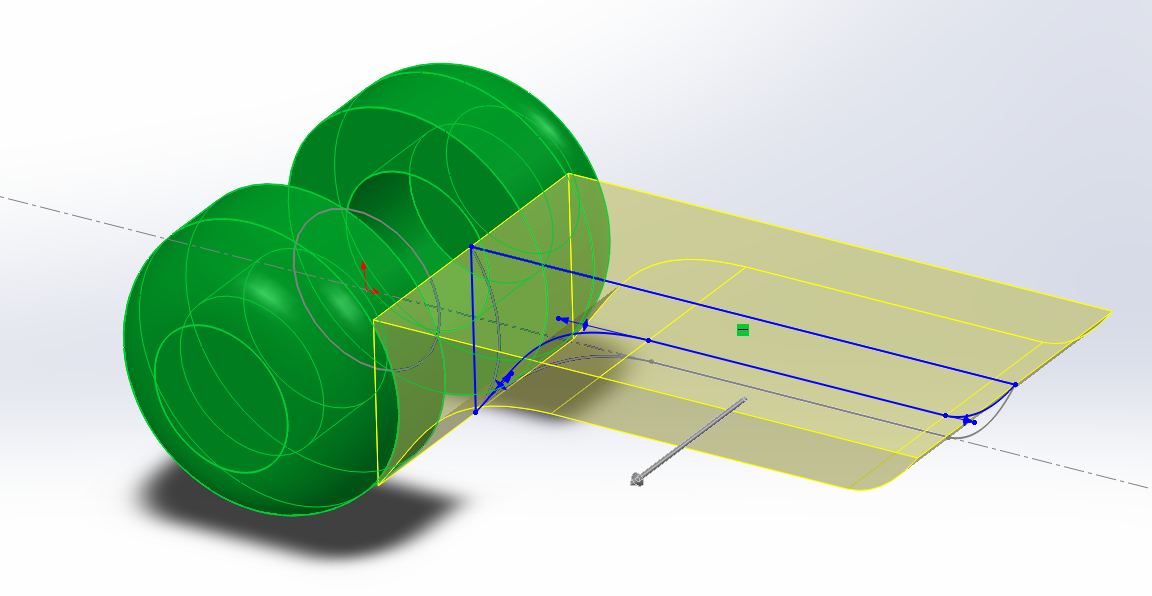
So, I've made the move into Solidworks now. Using my dimension sketch as my primary reference, and the architectural concept as my second point of reference, I embarked on what I consider to be the most daunting and most exciting part of the whole process. I've come to love Solidworks over the course of second year so far. It's pretty cool, and an extremely powerful program, and I find I'm really starting to think in a way that I can then translate into Solidworks models.

The part of the model that I started on first was the lesser of the two large segments. This piece involves the part of the model that "latches on" to the other half, surrounding the extruded axle with circular segments that will allow it to move.

This half is the part that draws a lot from the architectural precedent, in the way that the extrusion grows out of the central point. One of the elements that I also wanted to incorporate into this joint was the idea that it wasn't built, but rather grown, along a very simple geometric formula. The curves build the idea of an organic element, but ultimately they are still controlled and dictated by the linear elements of the model.

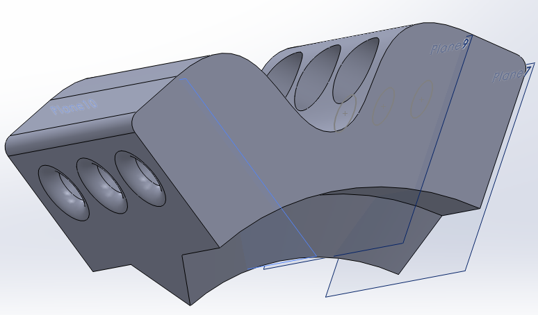
One of the parts that I wanted to build in were the pieces that the Bubble ship incorporated. I really liked the hexagonally symmetrical air vents. Now obviously my model doesn't need air vents, but as a subtle little aesthetic, they can work quite nicely.

I wanted to split the main section in two, so as to allow the model to have an architecturally senseless but graceful air. The architecture precedent really played on this idea of "Does that even really fit people in it??", but it looked incredible and just oozed pure futurism. The subtle curvature used in combination with the featuresque curvature really played on the idea of challenging the angularity as well as submitting to it.

One of the final elements that I built into this part was the slot going all the way through, an element that I had involved right from the beginning of the sketch. The double rounded triangles are a form that I've seen somewhere before, but I can't quite place where. The give the user a point of reference on the main form for the rotation as well as being aesthetic.

Another piece that I had to build into the model was a set of holes that pierce through the model, allowing for the elastic thread I've bought to be put through the model. This hole then transforms to a bigger hole on the far side of the model, so that I can attach a crimp to the thread, and then let the crimp fall back into the hole, so that there's no extraneous pieces of thread hanging around.


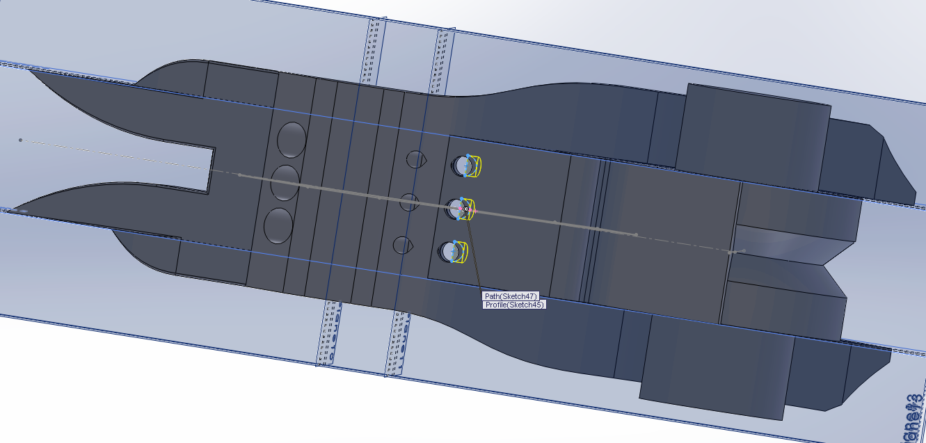
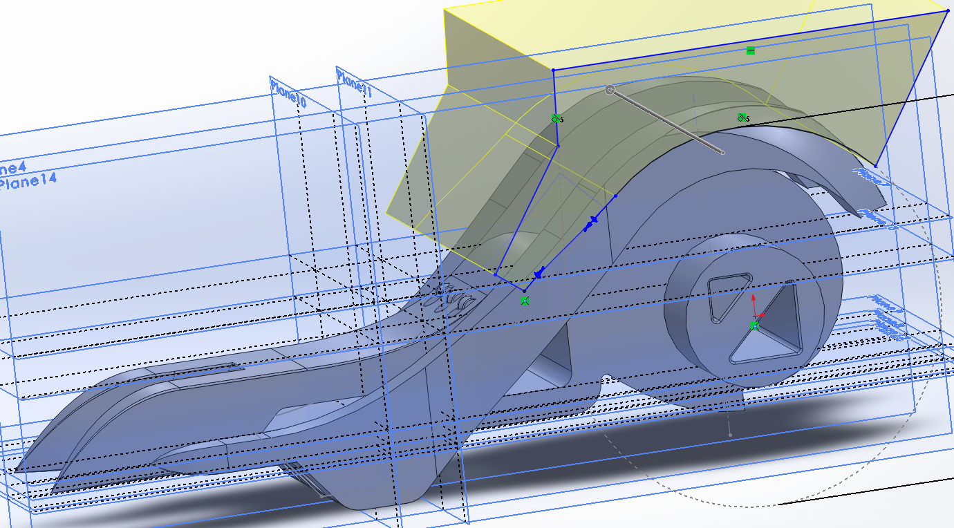
Part 2 is the much more extensive and tricky part to do, since it contains far more elements and therefore I need to give it more consideration. I started with the overarching curve and the spiral inner curve, which would allow the knee cap part to slide into the joint a little bit. This little consideration is really important in capturing the motion as a collective motion of multiple parts.

Once I had the overarching curve that would act as the stop for the bottom half of the joint, the rest of the top half could come together. I this step I really tried to capture the basic form I was going for. Lots of extrusions and perfect measurements needed to be made. For this piece to get the aesthetic I wanted, I wanted it to feel like it was a whole range of separate pieces coming together, but working as one.

This half of the model I also split into two at the end, so as to establish a connection between that half and the other half. This also creates a suggestion for where to hold the model, as the spaces create an edge that is comfortable to hold. For the knee joint to sit comfortably in place and actually stay in its place, it really needs to have a sort of rail, which I incorporated into the spiral edge.

One of the coolest elements that I built into this part of the model is the diagonal slope on the front curvature. It's quite a striking addition (or subtraction, technically!) and I really feel like it makes the model have a much more organic feel to it, with a combination of the harder lines and the stranger angled edges.

I then worked a little more on creating some additions to the overall shape, as well as making the model lose a bit of fat overall. One of the things that my tutor told me to experiment with was to remove some matter, making some more interesting surfaces visible.Again, most of the ideas for this element came from the feature wall in the Mass Effect architecture.

Once I had a concrete, workable form for the top half of the joint, I needed to come up with a solution for how to allow my elastic threads to fit into the model. I could have done the same thing that I did to the bottom half and have a top section that allowed the thread to fit into there. But I thought that since I just added a section in the space beneath the two bottom angular sections, I should use that area, as it would mean I'd have to put the thread through the model in a very interesting way.

Once I had that section working well, I decided to slim down the top overarching stopper curves, as they were a little fat now that I'm trying to refine the form into something a bit more elegant. The loss of matter and general filleting of some of the edges I wanted to smooth has allowed me to embody the images I've explored in this form.

This form is probably the more interesting one out the two main pieces so far, but that's okay. It's the half that's got a bigger role to play, so it deserves more attention. I managed to really slim it down by highlighting some interesting edges and the like, so it's good that I've been able to bring those out more.

The edges that I've exposed and made definitely put this form into a futuristic feel, and I think they make the model shine.

The next element I have to design is the knee cap. It has to be a subtle element, while at the same time still be a part that you notice, and actually see as being a working piece. The piece is going to have to be much more functional than aesthetic, since it's rather small.

Since I'm working at just getting the pieces to fit together perfectly, the way this piece fits to the other pieces is just with a simple triangular rail, that I've replicated on both sides. For this piece, I again utilised the Sebastien Voerman patent-pending Shifting Hole technology, so that the crimp can fall back into the hole and not be an issue.

Once I get to see it all together, it actually looks pretty sweet! Once I put all the parts together as an assembly, I did a motion study, and the pieces very much emulate the actual range of motion that the knee has. Which is very exciting.

Time to do some little prints!